François Rappo1st of April 2015, Lausanne
I want to know more about how you create or shape the subtle expressions in a body text typeface.
– Typography has a functional part, it’s a bit like a chair. If you are designing a chair you have the functional task, that people are going to sit on it. You need it to be stable, safe and functional. But when you want to go beyond that, that is quite difficult. Especially for body text typefaces, those are the most functional and the least spectacular of the letterforms. It’s also a bit like a sneaker, if you are out to buy a sneaker you may have a few different agendas. You may want it to have a nice color and shape, but if you are actually running a marathon you have a stricter functional agenda. Maybe it still has to have a nice color and design, but if you have to run for 42 kilometers, the ergonomic features are more important to you. The body text typefaces often seem to be very neutral, at least not very spectacular. But nevertheless they have some subtle qualities. Let’s take the most obvious subtle component, calligraphy. It’s quite easy to understand the logic of the stroke of a pen or a brush. For the reader it’s not important that its calligraphy, but they perceive that it has a second rhythm and optical flow. It is something which is based on hand movement, which gives a plus. This is for a limited amount of letterforms or typefaces. Readers may also love or appreciate the subtle quality of a geometric typeface, but that takes another filter to perceive. It is a difficult process, because you have to solve a few functional problems and then you have to go beyond to find an identity. We have groups of very consistent identities, construction and calligraphy. Sometimes it’s nice when a typeface is strongly constructed with circles and geometry, and other times it’s nice with a little rhythm. Also you have to have the optical fine tuning; to have a regular, very optically balanced typeface is good, especially if it’s mostly going to be used at small sizes. But when you are designing a typeface, you can come to the point where you think, «This could be a logical typeface, but do I like it?», and «Do I think it’s a plus? Is it a plus compared to the existing typefaces? Is it adding something to the type scene or is it just a generic variation?». It’s quite difficult. Today designers insist on this idea of authorship and giving something unique. But sometimes, at least for me, I like to revisit some of the more traditional styles, maybe of those a bit more anonymous. I think reading a typeface is just like to be seated on a chair. It’s a body experience, a visual experience and also a cultural experience. It’s a mix of all of them. But ergonomy and functionality are quite important. Maybe if one is modest, it’s also about taste, your taste or the taste of the people around you. You ask the people around you: «What do you think of this sketch?», and they give their opinion. It has to do with your environment, cultural environment, education and the context.
When you digitalize an old typeface, do you draw them as close as you can, and then change them?
– That depends. The original and the result are kind of two languages or dialects. You are translating the original to a new language. You have the source language and the target language. There is a gap, but that gap can also be quite narrow. For example, years ago I digitized Helvetica Medium for private use. With the Helvetica Medium you have a lot of information, prints of it are everywhere. In addition, the information is clear, the print is very sharp. The gap between the original and the digital does not immediately become that big there. But if you are making a revival of a Renaissance typeface; From when type was letterpressed and printed on wet damped paper, that will definitely make a gap. You are not using the same tools nor the same surface. The larger the gap is, the more you have to interpret. There is a distance between the two things, the organic ink on bad paper and the sharp digital bezier outline on screen. Of course you can make digital unsharp as well, but it still won’t achieve the same. Distortion of typefaces is in fact not new in the history of typography. Through the nineteenth century already, they had purposely rugged and noisy typefaces, by choice. It was letterpress type. William Morris and some others, by intention tried to keep a kind of noisy picture of the historical typefaces. If you build a house you can hide or show the structure, or the concrete. To have a perfect concrete or a rugged concrete, it’s not really new in typography.
When you drew the Theinhardt typeface, is that from the Royal Grotesk?
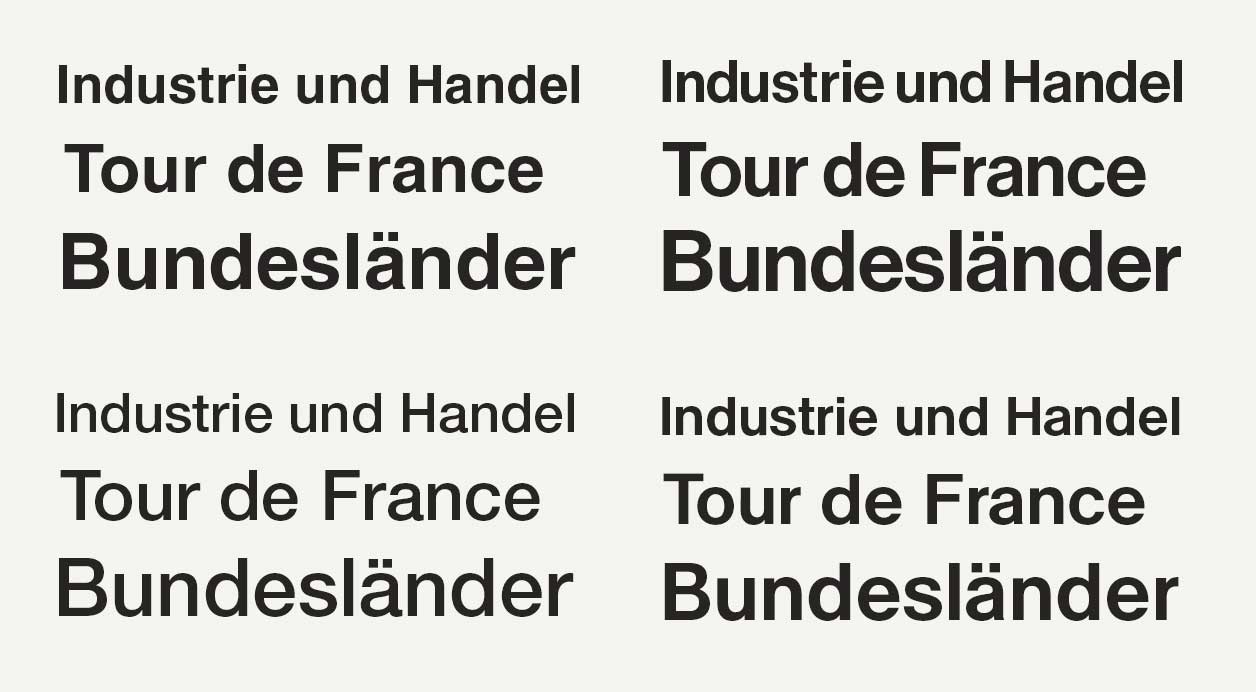
– It’s from the Royal Grotesk. I have only seen a single weight of the Royal Grotesk, a light weight. I never saw a medium or a bold. I think the Royal Grotesk worked as a complimentary light weight for Akzidenz Grotesk. I think Akzidenz Grotesk and Royal Grotesk were besides each other in the specimen. The Royal Grotesk was quite narrow, it was 11 different hand cuts, with small changes for each size. It was quite different from Akzidenz Grotesk actually. They were different Grotesks, that were not really connected in shape. I made a historical version and a smoother more modern version. I drew the light weight and then I extended it manually. I didn’t use interpolation a lot at that time, and I kept some strange solutions.The Berthold Specimen from the early thirties was my starting point. About ten years ago there was an interview with Günter Gerhard Lange, in Typografische Monatsblätter, and he said for the first time that Akzidenz Grotesk was not a product from Berthold. It’s from the König Giesserei and type designer Ferdinand Theinhardt. When I started gathering more information, I found Royal Grotesk in the Berthold specimen. Royal Grotesk was used a lot all up until the late fifties. It was a version designed for small sizes, you can especially se that on the «a» with the long hook.
 Theinhardt Light.
 From original Royal Grotesk specimen.
You don’t have a that long hook in your version?
– I left some of the hook in my version because at small sizes, it helps to make more space. It’s very nicely cut, I was very surprised by the quality of the print, which made it a good starting point. I kept these numerals, and that’s it.
You changed it a bit?
– I made a historical version, but I wanted to have something a bit more modern. Change also happens by intuition, by working with it, it changes. If I had followed the original precisely and kept that very strong hook on the «a», it would have looked dated. For the ones who cut the original it was natural with that strong hook. Imagine, they cut that by hand using other tools, the hook is a natural result of that. I discovered while you digitize, at a certain point, even if it is a good print, the gap is significant. It has happened so much with the information, while it’s printed with ink on paper, you have a lot of noise and information. To select the information from the image of the picture you have scanned, you have to deconstruct the typeface. Now that we may call interpretation, you have to deconstruct and to reconstruct it.
Does that mean measuring it?
– No, to figure out the DNA of the typeface, figuring out how it became the way it is. A typeface is connected to the tools used creating it. You must look at qualities those tools brings with them. Metal type looks different from wood type, the pen is different from that again. Like the trumpet like «s» is part trend and part tools, I made the first version of Theinhardt with a trumpet «s», but I wanted to modernize it. You may find some other designers that wanted to increase it. Deciding your approach to the DNA is also a part of the process.
Do you always modernize the old typefaces you digitize?
– I think it’s very difficult to be totally accurate. Nevertheless it’s three dimensional type printed with ink on paper. The Helvetica Medium was like a five day project, and it works quite well. The idea was to make a display version, but it worked very well at small sizes as well. With the Royal Grotesk I only had the small model from the original, so the text version became the model for both small and large size. You know it’s funny, at that time I remember there was a discussion among some designers. It was Fred Smeijers and Martin Majoor. They said everything regarding the Grotesk was covered. This was fifteen years ago, in the middle of this humanistic trend. «We can’t expect to have a new thing with the Grotesk», they said. Then I discovered this interview with Lange, and said: «Hey there’s an idea and it has a link with Helvetica». I made the first digital version and immediately we had some interest and buzz. It took me four years to make the entire family, and now it’s a cash cow. I make a lot of money with it, because everybody is interested in the Grotesk typefaces now, all kinds of them. There’s a huge revival streak, and it was totally unexpected. It’s clear I had Akzidenz Grotesk in mind, and it could be labeled as an alternate. But there’s a few changes, it has different proportions and the uppercase is lighter. I think it’s an interpretation in the end, even if you want to be very close to the original. It’s just a bigger or smaller gaps. With my specimen of Royal Grotesk there’s some distance to the information, so I had to interpret and make my own choices.
Do you think that the new and original version communicates a nuance difference?
– Probably, the interpretation is stronger than we expect. Again you have to really go deep into the details. In this Royal Grotesk specimen there are 11 masters, one master for each point size. They were not using the Pantograph at that time, so all of these 11 masters are probably cut by hand. If you digitize all these masters, and make them the same size, there will be a slight difference. Not a big difference, because the cuts are quite consistent. So there are 11 masters, and which one is the right one? With the digital you may also have 11 masters, but what is the point of that? There is also a question if one should have two masters, one for display and one for text. For Grotesk typefaces, I would say you only need one. In the beginning I thought yes, but no. I think a good design should cover both. I was surprised to see that the Helvetica, the Neue Haas Grotesk that Christian Schwartz drew, had two masters. A display and text master. In my version I made with just one single master. I was surprised to see how well it was working at small size, without any other changes. For a serif typeface, I think it’s different. There you can play with extra thin strokes, but for a mono-linear one, one does not need two masters. With the Helvetica Medium, which I call Antique, I have been quite faithful to the original. It’s a true revival. But if you pay close attention to some very complex details, at certain places you will see the difference. You have to choose because the old systems brings with it more variation, both positive and negative. When you had to cast the font and print with ink on paper. Even ink makes difference because ink flows. When it is as sharp as the digital type, you have to make precise choices. That makes it a bit different.
 From top: Helvetica LT, Helvetica Neue, Neue Haas Text (Schwartz) and Antique (Rappo).
 From the original Neue Haas Grotesk specimen.
 From left: Helvetica LT, Neue Haas Grotesk Display (Schwartz), Helvetica Neue and Antique (Rappo).
 Scan of original Neue Haas Grotesk specimen.
Do you think people perceive the difference between Helvetica and Arial?
– No, I don’t think so. Or it depends on the people who are buying the typefaces. We have digital typography now, which makes typography more and more popular, but nevertheless I think one as a type designer you have a very specific audience. The people buying typefaces, the art director and graphic designer, sometimes has a very clear idea of what the typeface should look like. Some of them may have the knowledge it takes to differentiate the subtle nuances in typefaces.
But the consumer, the reader, what do you think they pick up on? How big must the difference be for them to perceive it differently?
– Well, its like the sneaker again; It’s one thing to use a sneaker, it’s another thing to design it. One doesn’t usually ask this question. As a user you have some knowledge, but it’s the user knowledge. It’s a bit more passive. The user have their criteria, and I think the criteria is matching the designers criteria, but it’s more intuitive for the user. They think: «Hey, I like this one». It’s the tiny elements that develop a certain kind of atmosphere or visual value. In a continuous reading typeface, it’s what creates comfort, friendliness and tone.
Do you think they intuitively pick up on the atmosphere of a typeface?
– Definitely, but it’s difficult to make a definitive statement about it. When you see a sign on the wall, if it’s produced by stencil or by hand, even if you are not an expert that triggers something in your brain. You feel it, you have empathy for the movement behind the strokes. That goes for other genres as well, one can also have an appreciation for geometry and constructed letterforms. I think it’s a part of a direct experience both the reader and the designer are experiencing. Even if you’re not a specialist you still feel and experience typefaces.
In a typeface like Theinhardt, do you still mimic some handwriting?
– No, those are constructed letterforms. They are more or less based on some vertical contrast. I think it’s more based on the inscription or engraving. It’s constructed in terms of how Futura is geometrically constructed. There’s almost no calligraphy in Theinhardt, but it has a little that goes back to the nineteenth century. I think the idea of the Grotesk genre is to be a sort of primitive inscription style lettering.
Why do you think the Grotesks became popular again?
– It’s refreshing with this reappearing German Grotesk style, especially for books. Maybe there was a need for modernist and rational design, Grotesks and clear structure. Theinhardt is a bit more digital than Akzidenz Grotesk so it gives that kind of objective look. It’s specific to Swiss and German modernist books, and it’s a trend now. First it was my interest, then everyone found a new interest for Grotesks. It’s not by chance we now have Neue Haas Grotesk, and two new Unicas coming out. One of the Unicas is released by Lineto, with one of the original designers Christian Mengelt. I heard that Linotype is making one with no connection to the original Unica team. Almost all the foundries, small or large, have their own Grotesks. It’s really a trend, and maybe we are at the end of it? I don’t know.
Do you always reference one certain typeface?
– I made the Plain Grotesk, which is an attempt to do something connected to the late eighties. I wanted to have this cold optical atmosphere, and I had some references, but it’s not a revival. Typography has tradition, by taste I prefer a group of typefaces connected to the modernist movement. The Plain is based on that modernist movement. But I also like other genres, these days I’m working on a serif typeface which is very digital in a way, but it’s also based on the French Renaissance. It’s a solution that has no connection with any existing design. It’s a kind of revival, but the link is too small to call it that. My personal interest comes first, sometimes it’s a style, sometimes it’s a weird style. At one point I was interested in Clarendon and I wanted to make a revival different from the original. I felt a text Clarendon was missing, and wanted to create one if possible. It was very popular in the late fifties and sixties, but after that it disappeared. It originally was a display typeface, but I tried to make a text version part of the family. It was used as a text face in some early books, and I think it’s quite beautiful in text.
 From Optimo Plain Grotesk specimen.
 From Optimo Clarendon Graphic specimen.
In Plain you tried to create a cold atmosphere, how did you attain that?
– Well, geometry is one thing. It was a trend five years ago or more with geometric typefaces. An other inspiration was the late Swiss typefaces like Unica. As a type designer one may expect that the reader or designer will find certain features appealing, funny or interesting. It could be movement that follows the hand, geometry or some optical balance. The interaction between letterforms and shapes is also something that might appeal to the user. It was a fashion in the sixties that used a lot of pure shapes. Like the French women fashion designer André Courrèges. Shape that are not pure ideas, not based on any natural things or only in abstract ways. You have groups of inspiration. To make a cold typeface you can make the user not feel the carved steel, not feel the ink, not feel the hand and at the same time try to avoid to be a purely geometric like Futura. Defining a balance between all those elements affected by the traditional and modern tools. Sometimes your goal may be to create major sensational experience, and other times you just want to apply a tone or expression. You may want it to be haptic and done by hand, or maybe it is purely like an abstract painting, where you don’t see the brush strokes, or maybe you want to show the brush strokes. In Theinhardt you feel a bit of steel and rugged or old shapes, In Plain I wanted to have letterforms that are no longer based on any of those prehistorical tools. But still in the Grotesk genre, that’s the Plain Grotesk.
So you tried to escape the tools?
– Yes, but for me it is really a part of a feeling based intuitive process.
When you get commissioned work, do you ever get briefs in non-typographic terms?
– Sometimes it’s based on a model. For example, immediately after the release of Theinhardt I had two commissions. One was for the New York Times Magazine, they wanted to have an extra condensed version. Then came the Institute of Contemporary Art ( ICA ) in London, and they wanted to have a version where all the basic round letters were more circular. To make the new logo, ICA, they wanted to have an almost round «C», so it’s not extended but rounded. That was quite easy, because most of the rest was the same. Usually I am working with an art director, and they are allowed to translate it to a very simple brief. I don’t do that much commissioned work, it can be inspirational, but I like to have more time. I work quite fast, but I have a lot of ideas. For the Genath typeface, it took one week for the roman and one week for the italic. But after that it took years to develop it to the complete family. If an idea is clear, it’s very fast. But if you have doubts, if you feel it’s too historical or too modern, it takes more time. Maybe it works, it’s a possible typeface, but it’s not interesting enough, or it’s not expressing what I intended. I like to have maybe 50 self-initiated projects at the same time. Maybe some are just variations of the same one until you one day figure out which of them is the most interesting, and after that develop it into a family with many cuts.
 From Optimo Genath specimen.
 From Optimo Didot Elder specimen.
Do you draw all the weights yourself?
– Yes, I do it all by myself. I interpolate more and more now, but in the Theinhardt I drew all the cuts. The Clarendon I interpolated some weights in the italic, but I had to redraw the little bowls and endings. I try to save a little time by making the intermediate weight with interpolation. But mostly, I draw all the weights.
How do you develop typefaces?
– It’s a complex process. Sometimes it is very fast, and sometimes I have to stop. I don’t like to insist too much on a typeface, I prefer to stop and I wait until I have a clear idea of it. I just think about possible solutions, and I test them. On my shelves I have a lot of projects, sometimes one typeface creates the solution for some of the others on the shelf. Thinking about possible solutions and then testing them; «Is it working or is it blurring the original idea?»
Do you have a library of things to try?
– Yes, but I am kind of a newcomer. That is not a good word, but I was trained as a graphic designer. I am only trained to do some lettering, and it’s only through the digital tools I came to type design. I started to draw my own typefaces in the nineties. Even the history of typography at that time was quite unknown for me. I took time to revisit, collected some books and took some distance. I never had any clear plan, this just sort of happened to me. I started drawing type quite late, after I turned forty.
For type designers trying to attain this skill, what is your advice?
– I was as a graphic designer, but I was interested in typography. As a graphic designer, I was collaborating with a typesetter. I like reading and history, but had no plan. I was interested in the neoclassical style and so I collected information about the Didot. By chance I found a totally unknown Didot, the Pierre Didot. It was a strange Didot, and at that time the Didot was totally out of fashion. To my surprise I had some success with my first released typeface, the Didot Elder. Then I had no plan, but now I’m a bit less innocent. I was surprised how successful both the Didot and Theinhardt was, so now I tend to think a bit differently. It was just a hobby, but these days I could make a living out of it. As a graphic designer I must say that I love to see contemporary typefaces, I think they are extremely well designed, but I don’t want to use them. I think that has to do with the fact that I was trained in the seventies, and then it was always this idea of Frutiger’s Typefaces, Akzidenz Grotesk or other cold and rational typefaces. I like typefaces that are a bit rough. My favorite typefaces are less sophisticated than Theinhardt. I don’t know, I like metal like type.
So you don’t use your own typefaces?
– I use them more and more. But sometimes I can draw a typeface because it is a good experience. I like to draw type mostly, for my own use I prefer something a bit more brutal. The Genath is a good example, the Genath was a weird typeface. It was just a little research on Johann Wilhelm Haas first design for the Genath Foundry in Basle. Especially the italic was fun to draw. I thought it was unusable, until my friend Gilles Gavillet surprisingly used it for text in a book collection. It was really effective, and I decided to develop a complete family, and now it’s widely used. That is a typical thing, for me it’s too historical and weird. But at that time baroque was a trendy thing. It was at the same time as Erhard Kaiser released Fleischmann. I like to discover things and nowadays I’m interested in late modernist typefaces and the story behind them. Like Rotis and Gerstner, those are weird typefaces. I like them because no one is paying attention to them right now. They are weird for many reasons, but I like to try to find out what was in the type designers’ minds. It’s the first superfamily, it’s really interesting. I may not ever use the Rotis myself, I am just researching it because nobody is paying attention to it. It’s like the Grotesk 15 years ago, nobody were paying attention to it, but suddenly it became this big trend.
Do you feel that you can create any subtle expression in a typeface?
– No, I think in the end you have to define a certain taste. Some younger designers nowadays are thinking about the superfamily, to have the serif, sans serif, half serif and slab serif version of the same typeface. I like a typeface that has a strong identity. How would you have built up an identity in a superfamily? It’s difficult. We have to stay modest with that. For my taste, the interpretation of Helvetica by Christian Schwartz is American. Maybe it’s the tuning of the typeface version made for text, it’s not really achieving what was the original curve and drawing of Helvetica. Because with the original Helvetica you could write anything and it became a logotype, and why? Because each letter had a certain kind of identity, their own individual visual identity. I tend to think it’s a bit like music, if you are familiar with classic music you can play a German piece, but sometimes you have to be German play Schubert. You can’t say that, but I think there’s something to it. On the other hand there is a very successful global taste.
Is it impossible for the type designer to be invisible in a typeface?
– I think it’s like food. We have global foods now, like spaghetti and coffee. If you are very sharp with the components, anywhere in the world you can make a true Mexican, Italian or Norwegian meal, but you have to take time to select the right components. A designer, in a modest way has a certain touch. For example with Matthew Carter, he has a beautiful vision of those historical and maybe some contemporary typefaces. Matthew Carter is connected to Berthold Wolpe. Wolpe he is a former Rudolph Koch student who moved to the UK in the thirties. He is quite known for his typeface Albertus. If you compare that to the Carter Sans one can see there is kind of a connection there. Carter Sans is one of the latest typefaces designed by Matthew Carter, with a kind of carved contrast. Maybe the resemblance is a result of some British visual culture. Being a part of the same visual environment, or maybe it’s knowledge. The details creating this atmosphere are the tiny details as giving an accent on a curve ending. It’s so complex, and it’s a part of your culture. It has to do with your education, professional education, visual education, training and experience. And yes, maybe time will judge what truly defines the tone of a typeface, I don’t think it’s too individual sometimes.
There are more Royal Grotesks, have you seen this one?
– You know the owner of Berthold are American Lawyers, and they copyrighted the name Royal Grotesk. Their Royal Grotesk is Akzidenz Grotesk as it is, under a new name. They even tried to copyright the name Standard, which wasn’t possible, because it’s a too generic name. It is clear that because they bought the rights to the name they just had to use it. The law side of type design is still not very clear. Like when Linotype is releasing Unica with almost no agreement with Christian Mengelt.
How can one protect a typeface?
– Well, the software is protected. If you can prove that they have the same data, it’s clear, then its piracy. Name protection is not as strict as it should be. But it depends, if it’s a city or another generic name, you can’t copyright it. The design is very difficult to copyright, and who could judge the nuance difference between the different ones? What is a copy and what is a true new one? You have to depend upon the skill of your lawyer, and how much money you have to protect your typefaces, I’m afraid.
More interviews:
Erik Spiekermann 5th of March 2015, Berlin
Christian Schwartz20th of March 2015, New York
Retail typefaces:
Skriftkompani.no
I want to know more about how you create or shape the subtle expressions in a body text typeface.
– Typography has a functional part, it’s a bit like a chair. If you are designing a chair you have the functional task, that people are going to sit on it. You need it to be stable, safe and functional. But when you want to go beyond that, that is quite difficult. Especially for body text typefaces, those are the most functional and the least spectacular of the letterforms. It’s also a bit like a sneaker, if you are out to buy a sneaker you may have a few different agendas. You may want it to have a nice color and shape, but if you are actually running a marathon you have a stricter functional agenda. Maybe it still has to have a nice color and design, but if you have to run for 42 kilometers, the ergonomic features are more important to you. The body text typefaces often seem to be very neutral, at least not very spectacular. But nevertheless they have some subtle qualities. Let’s take the most obvious subtle component, calligraphy. It’s quite easy to understand the logic of the stroke of a pen or a brush. For the reader it’s not important that its calligraphy, but they perceive that it has a second rhythm and optical flow. It is something which is based on hand movement, which gives a plus. This is for a limited amount of letterforms or typefaces. Readers may also love or appreciate the subtle quality of a geometric typeface, but that takes another filter to perceive. It is a difficult process, because you have to solve a few functional problems and then you have to go beyond to find an identity. We have groups of very consistent identities, construction and calligraphy. Sometimes it’s nice when a typeface is strongly constructed with circles and geometry, and other times it’s nice with a little rhythm. Also you have to have the optical fine tuning; to have a regular, very optically balanced typeface is good, especially if it’s mostly going to be used at small sizes. But when you are designing a typeface, you can come to the point where you think, «This could be a logical typeface, but do I like it?», and «Do I think it’s a plus? Is it a plus compared to the existing typefaces? Is it adding something to the type scene or is it just a generic variation?». It’s quite difficult. Today designers insist on this idea of authorship and giving something unique. But sometimes, at least for me, I like to revisit some of the more traditional styles, maybe of those a bit more anonymous. I think reading a typeface is just like to be seated on a chair. It’s a body experience, a visual experience and also a cultural experience. It’s a mix of all of them. But ergonomy and functionality are quite important. Maybe if one is modest, it’s also about taste, your taste or the taste of the people around you. You ask the people around you: «What do you think of this sketch?», and they give their opinion. It has to do with your environment, cultural environment, education and the context.
When you digitalize an old typeface, do you draw them as close as you can, and then change them?
– That depends. The original and the result are kind of two languages or dialects. You are translating the original to a new language. You have the source language and the target language. There is a gap, but that gap can also be quite narrow. For example, years ago I digitized Helvetica Medium for private use. With the Helvetica Medium you have a lot of information, prints of it are everywhere. In addition, the information is clear, the print is very sharp. The gap between the original and the digital does not immediately become that big there. But if you are making a revival of a Renaissance typeface; From when type was letterpressed and printed on wet damped paper, that will definitely make a gap. You are not using the same tools nor the same surface. The larger the gap is, the more you have to interpret. There is a distance between the two things, the organic ink on bad paper and the sharp digital bezier outline on screen. Of course you can make digital unsharp as well, but it still won’t achieve the same. Distortion of typefaces is in fact not new in the history of typography. Through the nineteenth century already, they had purposely rugged and noisy typefaces, by choice. It was letterpress type. William Morris and some others, by intention tried to keep a kind of noisy picture of the historical typefaces. If you build a house you can hide or show the structure, or the concrete. To have a perfect concrete or a rugged concrete, it’s not really new in typography.
When you drew the Theinhardt typeface, is that from the Royal Grotesk?
– It’s from the Royal Grotesk. I have only seen a single weight of the Royal Grotesk, a light weight. I never saw a medium or a bold. I think the Royal Grotesk worked as a complimentary light weight for Akzidenz Grotesk. I think Akzidenz Grotesk and Royal Grotesk were besides each other in the specimen. The Royal Grotesk was quite narrow, it was 11 different hand cuts, with small changes for each size. It was quite different from Akzidenz Grotesk actually. They were different Grotesks, that were not really connected in shape. I made a historical version and a smoother more modern version. I drew the light weight and then I extended it manually. I didn’t use interpolation a lot at that time, and I kept some strange solutions.The Berthold Specimen from the early thirties was my starting point. About ten years ago there was an interview with Günter Gerhard Lange, in Typografische Monatsblätter, and he said for the first time that Akzidenz Grotesk was not a product from Berthold. It’s from the König Giesserei and type designer Ferdinand Theinhardt. When I started gathering more information, I found Royal Grotesk in the Berthold specimen. Royal Grotesk was used a lot all up until the late fifties. It was a version designed for small sizes, you can especially se that on the «a» with the long hook.
Theinhardt Light. From original Royal Grotesk specimen. You don’t have a that long hook in your version?
– I left some of the hook in my version because at small sizes, it helps to make more space. It’s very nicely cut, I was very surprised by the quality of the print, which made it a good starting point. I kept these numerals, and that’s it.
You changed it a bit?
– I made a historical version, but I wanted to have something a bit more modern. Change also happens by intuition, by working with it, it changes. If I had followed the original precisely and kept that very strong hook on the «a», it would have looked dated. For the ones who cut the original it was natural with that strong hook. Imagine, they cut that by hand using other tools, the hook is a natural result of that. I discovered while you digitize, at a certain point, even if it is a good print, the gap is significant. It has happened so much with the information, while it’s printed with ink on paper, you have a lot of noise and information. To select the information from the image of the picture you have scanned, you have to deconstruct the typeface. Now that we may call interpretation, you have to deconstruct and to reconstruct it.
Does that mean measuring it?
– No, to figure out the DNA of the typeface, figuring out how it became the way it is. A typeface is connected to the tools used creating it. You must look at qualities those tools brings with them. Metal type looks different from wood type, the pen is different from that again. Like the trumpet like «s» is part trend and part tools, I made the first version of Theinhardt with a trumpet «s», but I wanted to modernize it. You may find some other designers that wanted to increase it. Deciding your approach to the DNA is also a part of the process.
Do you always modernize the old typefaces you digitize?
– I think it’s very difficult to be totally accurate. Nevertheless it’s three dimensional type printed with ink on paper. The Helvetica Medium was like a five day project, and it works quite well. The idea was to make a display version, but it worked very well at small sizes as well. With the Royal Grotesk I only had the small model from the original, so the text version became the model for both small and large size. You know it’s funny, at that time I remember there was a discussion among some designers. It was Fred Smeijers and Martin Majoor. They said everything regarding the Grotesk was covered. This was fifteen years ago, in the middle of this humanistic trend. «We can’t expect to have a new thing with the Grotesk», they said. Then I discovered this interview with Lange, and said: «Hey there’s an idea and it has a link with Helvetica». I made the first digital version and immediately we had some interest and buzz. It took me four years to make the entire family, and now it’s a cash cow. I make a lot of money with it, because everybody is interested in the Grotesk typefaces now, all kinds of them. There’s a huge revival streak, and it was totally unexpected. It’s clear I had Akzidenz Grotesk in mind, and it could be labeled as an alternate. But there’s a few changes, it has different proportions and the uppercase is lighter. I think it’s an interpretation in the end, even if you want to be very close to the original. It’s just a bigger or smaller gaps. With my specimen of Royal Grotesk there’s some distance to the information, so I had to interpret and make my own choices.
Do you think that the new and original version communicates a nuance difference?
– Probably, the interpretation is stronger than we expect. Again you have to really go deep into the details. In this Royal Grotesk specimen there are 11 masters, one master for each point size. They were not using the Pantograph at that time, so all of these 11 masters are probably cut by hand. If you digitize all these masters, and make them the same size, there will be a slight difference. Not a big difference, because the cuts are quite consistent. So there are 11 masters, and which one is the right one? With the digital you may also have 11 masters, but what is the point of that? There is also a question if one should have two masters, one for display and one for text. For Grotesk typefaces, I would say you only need one. In the beginning I thought yes, but no. I think a good design should cover both. I was surprised to see that the Helvetica, the Neue Haas Grotesk that Christian Schwartz drew, had two masters. A display and text master. In my version I made with just one single master. I was surprised to see how well it was working at small size, without any other changes. For a serif typeface, I think it’s different. There you can play with extra thin strokes, but for a mono-linear one, one does not need two masters. With the Helvetica Medium, which I call Antique, I have been quite faithful to the original. It’s a true revival. But if you pay close attention to some very complex details, at certain places you will see the difference. You have to choose because the old systems brings with it more variation, both positive and negative. When you had to cast the font and print with ink on paper. Even ink makes difference because ink flows. When it is as sharp as the digital type, you have to make precise choices. That makes it a bit different.
From top: Helvetica LT, Helvetica Neue, Neue Haas Text (Schwartz) and Antique (Rappo).
From the original Neue Haas Grotesk specimen.
From left: Helvetica LT, Neue Haas Grotesk Display (Schwartz), Helvetica Neue and Antique (Rappo).
Scan of original Neue Haas Grotesk specimen.Do you think people perceive the difference between Helvetica and Arial?
– No, I don’t think so. Or it depends on the people who are buying the typefaces. We have digital typography now, which makes typography more and more popular, but nevertheless I think one as a type designer you have a very specific audience. The people buying typefaces, the art director and graphic designer, sometimes has a very clear idea of what the typeface should look like. Some of them may have the knowledge it takes to differentiate the subtle nuances in typefaces.
But the consumer, the reader, what do you think they pick up on? How big must the difference be for them to perceive it differently?
– Well, its like the sneaker again; It’s one thing to use a sneaker, it’s another thing to design it. One doesn’t usually ask this question. As a user you have some knowledge, but it’s the user knowledge. It’s a bit more passive. The user have their criteria, and I think the criteria is matching the designers criteria, but it’s more intuitive for the user. They think: «Hey, I like this one». It’s the tiny elements that develop a certain kind of atmosphere or visual value. In a continuous reading typeface, it’s what creates comfort, friendliness and tone.
Do you think they intuitively pick up on the atmosphere of a typeface?
– Definitely, but it’s difficult to make a definitive statement about it. When you see a sign on the wall, if it’s produced by stencil or by hand, even if you are not an expert that triggers something in your brain. You feel it, you have empathy for the movement behind the strokes. That goes for other genres as well, one can also have an appreciation for geometry and constructed letterforms. I think it’s a part of a direct experience both the reader and the designer are experiencing. Even if you’re not a specialist you still feel and experience typefaces.
In a typeface like Theinhardt, do you still mimic some handwriting?
– No, those are constructed letterforms. They are more or less based on some vertical contrast. I think it’s more based on the inscription or engraving. It’s constructed in terms of how Futura is geometrically constructed. There’s almost no calligraphy in Theinhardt, but it has a little that goes back to the nineteenth century. I think the idea of the Grotesk genre is to be a sort of primitive inscription style lettering.
Why do you think the Grotesks became popular again?
– It’s refreshing with this reappearing German Grotesk style, especially for books. Maybe there was a need for modernist and rational design, Grotesks and clear structure. Theinhardt is a bit more digital than Akzidenz Grotesk so it gives that kind of objective look. It’s specific to Swiss and German modernist books, and it’s a trend now. First it was my interest, then everyone found a new interest for Grotesks. It’s not by chance we now have Neue Haas Grotesk, and two new Unicas coming out. One of the Unicas is released by Lineto, with one of the original designers Christian Mengelt. I heard that Linotype is making one with no connection to the original Unica team. Almost all the foundries, small or large, have their own Grotesks. It’s really a trend, and maybe we are at the end of it? I don’t know.
Do you always reference one certain typeface?
– I made the Plain Grotesk, which is an attempt to do something connected to the late eighties. I wanted to have this cold optical atmosphere, and I had some references, but it’s not a revival. Typography has tradition, by taste I prefer a group of typefaces connected to the modernist movement. The Plain is based on that modernist movement. But I also like other genres, these days I’m working on a serif typeface which is very digital in a way, but it’s also based on the French Renaissance. It’s a solution that has no connection with any existing design. It’s a kind of revival, but the link is too small to call it that. My personal interest comes first, sometimes it’s a style, sometimes it’s a weird style. At one point I was interested in Clarendon and I wanted to make a revival different from the original. I felt a text Clarendon was missing, and wanted to create one if possible. It was very popular in the late fifties and sixties, but after that it disappeared. It originally was a display typeface, but I tried to make a text version part of the family. It was used as a text face in some early books, and I think it’s quite beautiful in text.
From Optimo Plain Grotesk specimen.
From Optimo Clarendon Graphic specimen. In Plain you tried to create a cold atmosphere, how did you attain that?
– Well, geometry is one thing. It was a trend five years ago or more with geometric typefaces. An other inspiration was the late Swiss typefaces like Unica. As a type designer one may expect that the reader or designer will find certain features appealing, funny or interesting. It could be movement that follows the hand, geometry or some optical balance. The interaction between letterforms and shapes is also something that might appeal to the user. It was a fashion in the sixties that used a lot of pure shapes. Like the French women fashion designer André Courrèges. Shape that are not pure ideas, not based on any natural things or only in abstract ways. You have groups of inspiration. To make a cold typeface you can make the user not feel the carved steel, not feel the ink, not feel the hand and at the same time try to avoid to be a purely geometric like Futura. Defining a balance between all those elements affected by the traditional and modern tools. Sometimes your goal may be to create major sensational experience, and other times you just want to apply a tone or expression. You may want it to be haptic and done by hand, or maybe it is purely like an abstract painting, where you don’t see the brush strokes, or maybe you want to show the brush strokes. In Theinhardt you feel a bit of steel and rugged or old shapes, In Plain I wanted to have letterforms that are no longer based on any of those prehistorical tools. But still in the Grotesk genre, that’s the Plain Grotesk.
So you tried to escape the tools?
– Yes, but for me it is really a part of a feeling based intuitive process.
When you get commissioned work, do you ever get briefs in non-typographic terms?
– Sometimes it’s based on a model. For example, immediately after the release of Theinhardt I had two commissions. One was for the New York Times Magazine, they wanted to have an extra condensed version. Then came the Institute of Contemporary Art ( ICA ) in London, and they wanted to have a version where all the basic round letters were more circular. To make the new logo, ICA, they wanted to have an almost round «C», so it’s not extended but rounded. That was quite easy, because most of the rest was the same. Usually I am working with an art director, and they are allowed to translate it to a very simple brief. I don’t do that much commissioned work, it can be inspirational, but I like to have more time. I work quite fast, but I have a lot of ideas. For the Genath typeface, it took one week for the roman and one week for the italic. But after that it took years to develop it to the complete family. If an idea is clear, it’s very fast. But if you have doubts, if you feel it’s too historical or too modern, it takes more time. Maybe it works, it’s a possible typeface, but it’s not interesting enough, or it’s not expressing what I intended. I like to have maybe 50 self-initiated projects at the same time. Maybe some are just variations of the same one until you one day figure out which of them is the most interesting, and after that develop it into a family with many cuts.
From Optimo Genath specimen.
From Optimo Didot Elder specimen. Do you draw all the weights yourself?
– Yes, I do it all by myself. I interpolate more and more now, but in the Theinhardt I drew all the cuts. The Clarendon I interpolated some weights in the italic, but I had to redraw the little bowls and endings. I try to save a little time by making the intermediate weight with interpolation. But mostly, I draw all the weights.
How do you develop typefaces?
– It’s a complex process. Sometimes it is very fast, and sometimes I have to stop. I don’t like to insist too much on a typeface, I prefer to stop and I wait until I have a clear idea of it. I just think about possible solutions, and I test them. On my shelves I have a lot of projects, sometimes one typeface creates the solution for some of the others on the shelf. Thinking about possible solutions and then testing them; «Is it working or is it blurring the original idea?»
Do you have a library of things to try?
– Yes, but I am kind of a newcomer. That is not a good word, but I was trained as a graphic designer. I am only trained to do some lettering, and it’s only through the digital tools I came to type design. I started to draw my own typefaces in the nineties. Even the history of typography at that time was quite unknown for me. I took time to revisit, collected some books and took some distance. I never had any clear plan, this just sort of happened to me. I started drawing type quite late, after I turned forty.
For type designers trying to attain this skill, what is your advice?
– I was as a graphic designer, but I was interested in typography. As a graphic designer, I was collaborating with a typesetter. I like reading and history, but had no plan. I was interested in the neoclassical style and so I collected information about the Didot. By chance I found a totally unknown Didot, the Pierre Didot. It was a strange Didot, and at that time the Didot was totally out of fashion. To my surprise I had some success with my first released typeface, the Didot Elder. Then I had no plan, but now I’m a bit less innocent. I was surprised how successful both the Didot and Theinhardt was, so now I tend to think a bit differently. It was just a hobby, but these days I could make a living out of it. As a graphic designer I must say that I love to see contemporary typefaces, I think they are extremely well designed, but I don’t want to use them. I think that has to do with the fact that I was trained in the seventies, and then it was always this idea of Frutiger’s Typefaces, Akzidenz Grotesk or other cold and rational typefaces. I like typefaces that are a bit rough. My favorite typefaces are less sophisticated than Theinhardt. I don’t know, I like metal like type.
So you don’t use your own typefaces?
– I use them more and more. But sometimes I can draw a typeface because it is a good experience. I like to draw type mostly, for my own use I prefer something a bit more brutal. The Genath is a good example, the Genath was a weird typeface. It was just a little research on Johann Wilhelm Haas first design for the Genath Foundry in Basle. Especially the italic was fun to draw. I thought it was unusable, until my friend Gilles Gavillet surprisingly used it for text in a book collection. It was really effective, and I decided to develop a complete family, and now it’s widely used. That is a typical thing, for me it’s too historical and weird. But at that time baroque was a trendy thing. It was at the same time as Erhard Kaiser released Fleischmann. I like to discover things and nowadays I’m interested in late modernist typefaces and the story behind them. Like Rotis and Gerstner, those are weird typefaces. I like them because no one is paying attention to them right now. They are weird for many reasons, but I like to try to find out what was in the type designers’ minds. It’s the first superfamily, it’s really interesting. I may not ever use the Rotis myself, I am just researching it because nobody is paying attention to it. It’s like the Grotesk 15 years ago, nobody were paying attention to it, but suddenly it became this big trend.
Do you feel that you can create any subtle expression in a typeface?
– No, I think in the end you have to define a certain taste. Some younger designers nowadays are thinking about the superfamily, to have the serif, sans serif, half serif and slab serif version of the same typeface. I like a typeface that has a strong identity. How would you have built up an identity in a superfamily? It’s difficult. We have to stay modest with that. For my taste, the interpretation of Helvetica by Christian Schwartz is American. Maybe it’s the tuning of the typeface version made for text, it’s not really achieving what was the original curve and drawing of Helvetica. Because with the original Helvetica you could write anything and it became a logotype, and why? Because each letter had a certain kind of identity, their own individual visual identity. I tend to think it’s a bit like music, if you are familiar with classic music you can play a German piece, but sometimes you have to be German play Schubert. You can’t say that, but I think there’s something to it. On the other hand there is a very successful global taste.
Is it impossible for the type designer to be invisible in a typeface?
– I think it’s like food. We have global foods now, like spaghetti and coffee. If you are very sharp with the components, anywhere in the world you can make a true Mexican, Italian or Norwegian meal, but you have to take time to select the right components. A designer, in a modest way has a certain touch. For example with Matthew Carter, he has a beautiful vision of those historical and maybe some contemporary typefaces. Matthew Carter is connected to Berthold Wolpe. Wolpe he is a former Rudolph Koch student who moved to the UK in the thirties. He is quite known for his typeface Albertus. If you compare that to the Carter Sans one can see there is kind of a connection there. Carter Sans is one of the latest typefaces designed by Matthew Carter, with a kind of carved contrast. Maybe the resemblance is a result of some British visual culture. Being a part of the same visual environment, or maybe it’s knowledge. The details creating this atmosphere are the tiny details as giving an accent on a curve ending. It’s so complex, and it’s a part of your culture. It has to do with your education, professional education, visual education, training and experience. And yes, maybe time will judge what truly defines the tone of a typeface, I don’t think it’s too individual sometimes.
There are more Royal Grotesks, have you seen this one?
– You know the owner of Berthold are American Lawyers, and they copyrighted the name Royal Grotesk. Their Royal Grotesk is Akzidenz Grotesk as it is, under a new name. They even tried to copyright the name Standard, which wasn’t possible, because it’s a too generic name. It is clear that because they bought the rights to the name they just had to use it. The law side of type design is still not very clear. Like when Linotype is releasing Unica with almost no agreement with Christian Mengelt.
How can one protect a typeface?
– Well, the software is protected. If you can prove that they have the same data, it’s clear, then its piracy. Name protection is not as strict as it should be. But it depends, if it’s a city or another generic name, you can’t copyright it. The design is very difficult to copyright, and who could judge the nuance difference between the different ones? What is a copy and what is a true new one? You have to depend upon the skill of your lawyer, and how much money you have to protect your typefaces, I’m afraid.
More interviews:
Erik Spiekermann 5th of March 2015, Berlin
Christian Schwartz20th of March 2015, New York
Retail typefaces:
Skriftkompani.no
All interviews are done by Arve Båtevik as a part of the BA thesis «Subtle Expression in Typography». Found a mistake or have other feedback? Send a mail to post [a] arvebaat.com
BAAT AS © 2015–2020
BAAT AS © 2015–2020