Christian Schwartz20th of March 2015, New York
Type Design: Frameworks, Revivals, and Expression – Interview
When draw body text typefaces, would you say that you operate with a 95 percent established framework?– I don’t know if I would narrow it down to a percentage. I mean there is only so much you can do to an «a» before it’s not an «a» anymore, so that’s a good starting point.
Rivals and Designer Fingerprints
When you do revivals they often differ from the originals, is that purposefully done?– I think that if you are touching something, it’s impossible not to leave your fingerprints on it. So in a revival you can be conscious of trying to be as faithful to the source as possible. But unless you’re going to work with the same tools and materials, in the same environment and society, you can never make the same thing. I think there’s two approaches to revivals. One is the method acting approach; Try to embody what the person who originally cut the punches or drew these drawings were thinking. What would they have done and how did they make their decisions. The other way is to look at the artifact, and not try to reconstruct what the thought was, just take the artifact as an artifact and interpret it from there. You’re not trying to figure out what the punches looked like before they were struck into the matrices and printed on paper. In that approach, you have some letterforms on paper and you take and try to make something contemporary out of it.
Contemporary Use of Revivals
Do you always try to make it contemporary?– I try to make them usable in a contemporary context. I’m not so interested in making museum pieces, things that wouldn’t be usable other than admiring them and saying: «Well, this looks very much like the old typeface». I think very interesting things can happen in graphic design when you take old typefaces and put them in a new context. Paul Barnes’ Brunel is an excellent example of that. It is a revival of the archetypal nineteenth century English Modern, he has tried to reconstruct that as faithfully as he could. Starting from 1796 he has still made it something that embodies really what it was. When you put Brunel into a contemporary context, it doesn’t look like a really old typeface. It can look appropriate in a fashion magazine, a business magazine and for the identity of a restaurant. It’s an old typeface in new layouts, because the way a typeface is used affects how it’s perceived as much as the typeface itself. If you take these old typefaces and use 1970s spacing with them, then they feel more like the 1970s than the 1850s. That is the really interesting thing about doing revivals, that idea of re-contextualizing.
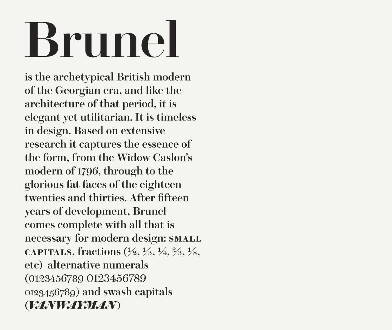 From Brunel specimen.
Neue Haas Grotesk and Helvetica: Restoration vs. Copies
With the Neue Haas Grotesk, what was your goal compared to the original?– Helvetica got ruined twice, maybe three times or maybe four times. Linotype took the Neue Haas Grotesk design and fit it onto duplexed Linotype matrices, which meant the regular and bold were forced to exactly the same character widths. The bold got a little narrower and a little tighter, and the regular got opened up a bit. When it was redone for the duplexed matrices it was still drawn in multiple point sizes. But when Helvetica went to phototype, they used just the 24 point for everything. It was the most popular typeface in the world, so it was also the first typeface to get digitized. There weren’t even visual tools for digitizing type then. Helvetica was projected on to the wall on a 1000 by 1000 unit grid, and they counted squares(!). They programmed in the coordinates, adjusted and tweaked the bezier off curve points until it looked convincing enough as Helvetica. So what you have is a copy, of a copy, of a copy, of a copy. I think that’s the right number of copies. So I wanted to go back to the original. I didn’t have access to the original drawings, punches, matrices or any of the original material. All I had was two or three Haas Specimens. I could see the type set in the way Haas intended for it to be seen by people. I took it as the artifact, not worrying about the development of it or anything like that. Taking what it looks like on paper, and work from that. How do we replicate this, sort of platonic ideal of the Helvetica concept. It was for the Guardian originally, they were using Neue Helvetica which is yet another copy that was redrawn for interpolation. So that Linotype could manipulate it into narrower and wider forms to make a larger and more rational family more easily. But even in that interpretation it took on a certain squareness, and lost some of the round organic nature of the curves. My version of Neue Haas Grotesk is essentially intended to be a restoration. It was like taking a great old house, stripping out all the bad linoleum that was added to it in the seventies, all the weird wall paper, and the extension that didn’t ever quite fit in, strip it back to it’s bones and restore it to what it was when it first was built.
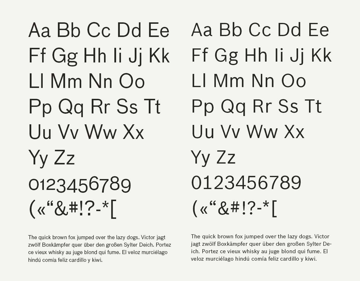
 From top: Helvetica LT, Helvetica Neue, Neue Haas Text (Schwartz) and Antique (Rappo).
 From the original Neue Haas Grotesk specimen.
 From left: Helvetica LT, Neue Haas Grotesk Display (Schwartz), Helvetica Neue and Antique (Rappo).
 Scan of original Neue Haas Grotesk specimen.
Restoring Texture, Spacing, and Function
What do yours and Linotype’s Helvetica communicate differently?– It’s not that the Linotype version is bad, it’s just not what the original artifact was. When the original Neue Haas Grotesk was released back in 1958, the spacing was done a particular way. This was one of the first really tightly spaced headline faces. Mine has some of that original spacing. I also did a separate display and text version, and in that way restored an ability that designers had with the metal type, which they didn’t quite have with the digital version. The digital version was done from a 24 point master, so for display stuff it looks pretty okay, its maybe a bit too loose. But for text it is way too tight. Where the arches and stems meet it clogs up a little bit, because it hasn’t been compensated for use in small sizes. In doing a seperate text version I put in all those compensations, and looked really closely at the handset metal type at 9 and 10 point, and figured out how that was made to look so good. Because in the Haas specimen Neue Haas Grotesk has a wonderful texture, it was a pleasant typeface to read.
So do you think people subliminally experience that?
– I think so, maybe not everyone. There are a lot of graphic designers that really do not care that much about text. For them text is this grey block on the page, which they need to put it somewhere. But for a newspaper text is really important, because a newspaper is still primarily words. No matter how many photos, info graphics, maps and things like that you have in there, newspapers are really first and foremost about text. That was the reason why drew the separate text and display version in the first place. For Bloomberg Businessweek, again a really dense magazine full of text content, having a text version of Neue Haas Grotesk was really important for them. Then they didn’t have to manipulate text settings at all. They could just set up a style sheet with the correct text version and there’s no need for compensation, there’s no messing around, it just works.
So the primary goal was to make it better for text then?
– I made a text version better for text and the display version to have that smoothness that the original had. The Neue Haas Grotesk Halbfette is one of the most perfect display typefaces of all time; the spacing is great and it’s a perfect poster weight. It’s not overly bold, but it really holds interest. It just holds well in a poster, book cover or magazine headline, in a way that the Neue Helvetica Medium doesn’t quite. Neue Helvetica Medium is a little wider, looser and lighter in additon the curves aren’t quite as tight. It feels a little bit unsprung, so my version was meant to be a little more tightly wound. The words kind of form into these very clean rectangular modules which are really great to design with.
That’s why I think it’s popular, because it immediately looks pleasing, especially if you don’t care about reading.
– Yes, smooth and modular. It is very easy to design a poster with it and have the poster look good. It doesn’t take a lot of extra effort on the part of the graphic designer. That is what the typeface was designed for, both in the metal and digital version.
Drawing from Memory and Designer Style
Spiekermann mentioned that you drew Antique Olive from memory, is that a method you use often?– That was kind of a response to whatever the type designer version of writers block is. I didn’t have any ideas and I read a lot about different bands finding their signature sound through trying to play songs they loved from memory. Like the Ramones were trying to play classic Phil Spector, Wall of Sound pop songs. But they didn’t know enough chords and they were not that good at playing their guitars, so they just played really fast and really loud. But Phil Spector was what they were going for, and in missing the mark they made something new. I wanted to see if that was possible to do in type design. Bruce Rogers had experimented with this idea a bit with Centaur, where he had photographic reproductions of incunabula and he was tracing over it again and again, with a broad nib pen. Until he felt that he kind of internalized the proportions, shapes and constructions of the letters. Then he put the photographs away, and just drew with his broad nib pen. That’s where Centaur came from. Which made me curious to see, without ever looking at the thing again, what did I remember about the Antique Olive? Would it be kind of a perfect duplicate of it, or would it be somewhere in between Antique Olive and not?
 Over Antique Olive, under Duplicate Sans.
Personal Style and Collaboration
Did it work for you then?– I guess the other thing I was trying to figure out at that point was what my style looks like. People tell me that I have a style, and a particular way of drawing, but I don’t really see it myself. So I was wondering if I tried to draw something else, and then I compared it to the original, could I subtract Antique Olive from what I drew and see what my style is? Because my style is there whether I want it or not, but it’s hard for me to see it.
How visible are the type designers in their typefaces?
– Spiekermann is an interesting case because in most of his typefaces, a lot of the work has been done by other people, and yet his typefaces are a very consistent body of work aesthetically. So Spiekermann definitely has a style, and it’s so strong that he can get his style out through others. Looking at Unit you can see his style, maybe a bit more than mine.
You drew that for him?
– Yes, but on Unit he didn’t do any drawings or anything. We just had a couple of phone calls and he said: «It’s going to be like Meta but all these things need to be removed, and these things need to be played up a little more. The contrast should be this, the proportions should be slightly narrower, the spacing should be generous like this, it’s going to be used for these things», and then I drew Unit. The first draft are not that different from what the final thing was. There are a bunch of alternates that fell by the wayside as we went through the process, but overall it’s pretty much the same. Erik is a great art director, because he can articulate his vision so clearly that he gets what he’s envisioning in few steps.
Client Communication and Physical Features
When clients describe what they want in non-typographic terms, is that easier or harder to work with?– Depends on the common vocabulary with the person. With Paul, I know what he means. Erik I have worked with before so I knew what he meant as well. With some clients it takes some work to develop that common vocabulary. But with clients, the people we work with tend to not have commissioned a lot of typefaces. They tend not to have drawn any type themselves, so they don’t necessarily know all the proper terminology, the terms that type designers would use to talk to each other about type. The descriptions between type designers tend to be pretty abstract as well.
When you make a typeface for a brand, do you mimic the physical features?
– Type design is a hard thing to articulate in words. With the Stag typeface, which I did for the mens magazine Esquire, they wanted a typeface which above all it had to be masculine. That was the first part of the brief that they gave me, and they said they wanted it to contrast against the typefaces they already had in the magazine, they wanted to add it rather than replacing something that was already there. They wanted it to feel sophisticated, but as bold as possible, and to splash as much ink across the page as we could. In other words super, super heavy. It was going to be used big, and just a few words at the time. From that, I decided to make the counter-forms and the spaces between the characters structurally different, to add a little more texture to it. Knowing that it was just going to be a few letters at a time, I wanted to do something to liven it up. Not just to be a very static slab serif form. But I couldn’t talk to them about serif bracketing, because their eyes would glaze over. Magazine art directors are not just thinking about the type, they are thinking about the editor maybe killing the story they just spent three days designing, they have to reshoot for this, the fashion director just came by to and said they couldn’t get that thing that they wanted for the cover, so they have like 15 different things at all times every day. So drilling down to details of bold terminals is a very difficult thing to get them to focus on. We deal more with abstractions. «Does this feel masculine enough?» or «Does this feel journalistic enough?».
 Scan of Egyptian Specimen from the Deberny & Fils foundry to the left, Stag to the right.
References and Cultural Baggage
Is that harder for you?– No, I was trained as a graphic designer, so I’m used to talking about graphic design, and I like to talk about graphic design. I think that’s why we focus so much on with working with clients, because there is a special kind of alchemy there. When we work with a client we come out with something different than if we were just working on our own.
Did you reference any typeface with Stag?
– Kind of, I showed them a bunch of historical typefaces, and we talked about what they liked and what they hated. To me Stag is very closely connected to this very bold antique Egyptian from the Deberny & Fils foundry in Paris, around 1900. But if you look at them next to each other, it’s really hard to see the connection. To me a clear jumping off point, but in the final typeface it’s hard to see those roots.
Do you always have a reference?
– Well, there’s the 95 percent, and the 5 percent. You are always building on what came before. If you’re ignorant of it, you’re probably going to repeat it by mistake. If you know about it, you can use it to your advantage, or you can react against it. I try to look at some historical typefaces and see if they spark some idea. I don’t necessarily want it to be that these particular letters ending up looking like those particular letters. It’s more the way that curve transitions were made, or some other feature I find interesting. A tone and a feeling.
Do you sometimes see a tone that you like, but you want to make it more masculine for example?
– Yes.
So that is how you shape the expression then?
– These are hard things to talk about in words, I’m used to expressing these ideas through drawing letters. A big part of type design is trying to shape the expression and the way people perceive the content when they read it. Whether you’re getting in the way or getting out of the way, you do have some impact on the way people perceive text. Part of that is cultural, someone in France is going to feel very differently about a headline in Antique Olive, than somebody in America, which is because of when and where it was used most.
So the cultural baggage is something you have in mind when you draw a typeface?
– For a custom project definitely. For retail typefaces, we just release them to the public and see what happens… I’m always telling the younger designers working here, if you don’t like surprises, you shouldn’t release typefaces. Because you will be surprised with where it ends up. It’s true, and that’s the really fun part. Like Druk has become really popular for fashion journalism in Scandinavia. But in the Netherlands, it’s totally not a fashion thing, it’s more like cultural institutions want to use Druk. There it’s an art typeface, in Scandinavia it’s a fashion typeface.
I actually worked for an American guy, who studied in the Netherlands and works in Oslo, who used that for Oslo Art Weekend.
– See, and it’s Scandinavia meets the Netherlands.
If a client gives you a certain expression, where do you start?
– So after talking things over with the clients, Paul and the other guys working here, we ask that the client gives us a headline, so that we can draw some piece of text that they can relate to. Then we try to cast the net really wide, and just try a lot of different things, and see how we feel when we look at them.
Is there a certain set of letters that are important to envision the whole expression?
– Yes, capital «R», lowercase «a», the treatment of the spine of an «s» and lowercase «g». Those are letters where you typically can get away with adding more personality. There are the letters that basically just have to be functional, and there are those you can add a bit of personality to. It’s hard to put a lot of personality into a lowercase «i». With an uppercase «R» or «Q», you got a lot of opportunities. And how does it change the overall feeling of things if the two «V» shapes of the «W» cross, or meet in the middle, or the first one is truncated. You never know until you see it in context. But sometimes if it’s too heavy, you know it won’t work, because it physically can’t be drawn.
You have a library of things to try then?
– Sort of yes, informally in the back of my mind there is a library. There might be some form or curves that I would love to try one day, and maybe I find a moment where it fits perfectly. I think a lot of type designers have that.
Did you make the double story «g» in the Bau?
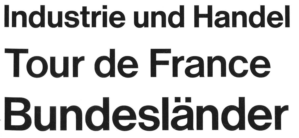
– No, Paul asked the same thing, he thought I made it up. That is absolutely one hundred percent from the original. I made a single storey alternate. Erik told me where to find the typeface, I can show you the specimen where it came from. There it is, I did not make this up. This book is older than all of us. Oh, there it is again, with a different proportion. So what I added to Bau was a couple of alternates inspired by the Haas version. Haas made a copy of Bau and called it Alte Haas Grotesk, before Neue Haas Grotesk was the old one. They gave it a single story g, simplified the form. After that it got copied by Nebiolo foundry, so the simplified single storey «g» was actually more common in that typeface than the original one.
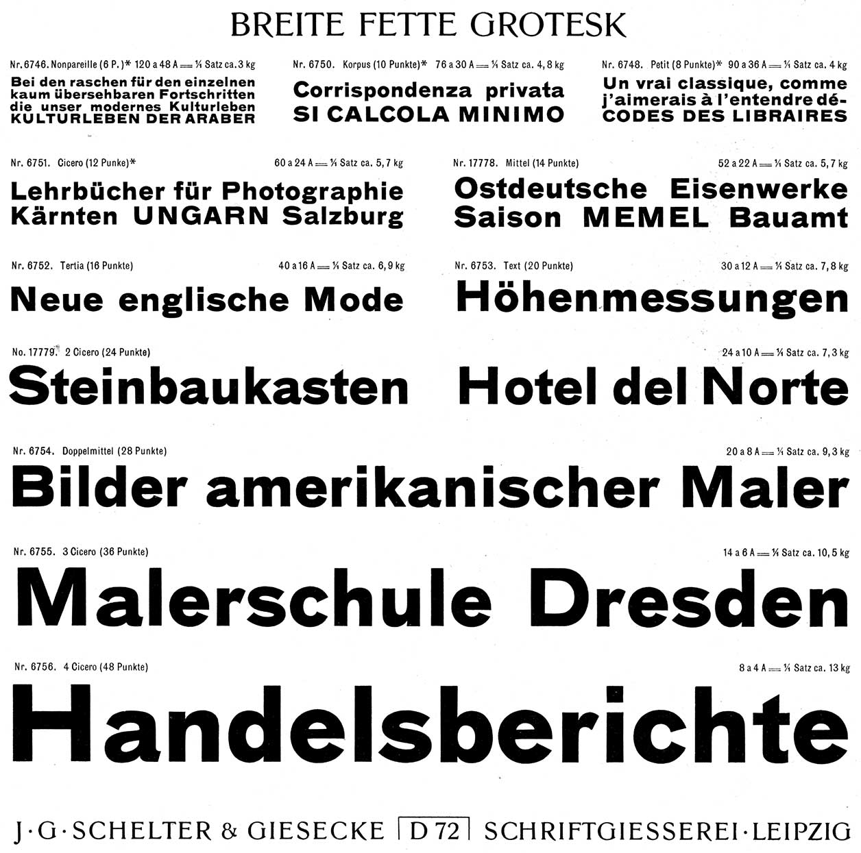 Original specimen from Schelter & Giesecke.
Type Specimens and Modernization Decisions
You started with this specimen for both the Bosch and the Bau typeface?– We kind of started with this for Bosch, but that was more just so that Erik could show the client something. Say it could be kind of like this, but it’s going to be more compact, rounder, not so explicit and not so pointy. That was more for the sake of having a point of discussion with the client. It ended up really far from the specimen, the Bosch version is much cleaner. Because Bau wouldn’t have been appropriate for a contemporary German company.
 Bau to the left, Bosch Sans to the right.
Why did you decide on the least common one?
– It was in the original material, and it was such an important part of the personality of Bau. If you look at the Bauhaus graphic design that used Bau, that double storey «g» is there. People think of the Bauhaus as all in Futura, but it really was in whatever sans serifs they could get their hands on. Leipzig is close to Dessau, so they had access to Schelter & Giesecke typefaces—it was their local type foundry. I think a big reason why the Bauhaus liked to set everything in all lowercase was because the caps in these typefaces were really wide and heavy. In German Bau looks very jarring every time you see a capital letter. I think that if they had the tools that we have now, they would have drawn typefaces that had caps that were smaller, lighter and narrower that fit better with the lowercase. But without that option, they just removed them entirely.
Drawing, Regularization, and OpenType
When you draw a typeface like that, do you first draw it perfectly and then edit it?– That was a long discussion I had with Erik, because each of the weights in Bau were probably made by different sets of people. Some typefaces might have each size cut by somebody different. Because punch cutters were freelance craftsmen, the foundries scheduled the one they could get on a particular day. Then they had them work on whatever they needed them to work on. The idea of the type designer as the individual genius coming up with the idea of all these letters, was not really a thing. You would have an art director at the foundry, who would sort of set the tone. The punch cutters would make things which would be more or less consistent, or as in consisted as they ended up being. The regular in the Bau typeface, have a bunch of letters that do completely different things than in the medium and the bold. The medium has a much bigger x-height than the regular and the bold. Erik and I had a lot of discussions about what we were going to keep or not. If we kept the original forms and have everything mismatch, would that make it look too much like a museum piece rather than a usable contemporary typeface? Or by regularizing, are we ruining it? Does it then become any other sans serif and who cares? This was pre-Open Type, so we split the difference. Each weight was drawn individually, and they had the differences in x-height, proportions and all the different things. But then some of the more distinctly different features in the regular were made consistent with the rest of the weight, so that it felt a bit more like a family. But when we did the Open Type version a few years later, I brought the distinct features back. With the Open Type one you can set something that looks very much like the Schelter Grotesk.
Is that how you usually do it?
– I don’t know if there is a way that I usually do it. Each project is different and a lot of that is because we mostly work for clients. There is usually somebody who needs something, and maybe that is something very accurate to something historical, maybe it’s something that is completely contemporary, or maybe it’s something that’s a contemporary interpretation of something old. But the client is really the one driving the whole process with their needs.
Do you ever draw by hand?
– Sometimes a bit to figure things out, but I don’t do drawings of letters, scan them and than trace them.
Have you done that when you worked for others?
– No, Paul has done it a little bit. I always space as I draw, so it’s hard for me to come up with letterforms not in context. I prefer to work on the computer where I can draw something, space it, and see how it works in words immediately. But Miguel, one of the designers that works here, is much better at drawing by hand than I am. He will sometimes start typefaces by hand.
Process, Sketches, and Results
But if you get a sketch by Spiekermann, do you just look at it and draw it digitally?– Erik has said this himself enough that I can say it. Generally when you see a sketch by Spiekermann, the typeface was done, then he got some paper and a pencil out and than he traced over it, and he wrote some things besides it. Because those sketches, those are publicity beauty shots, those are marketing materials, they are not generally part of the process. So when I’ve seen some sketches, I have been surprised. But it helps to make the story more relatable, because that’s how people want to think that type design is done. Like, somebody did pencil sketches and then they wrote some notes by it, then somebody else took it and put it in the computer and did things. That’s often not how the process goes, I’m much more likely to use interpolation as a design tool, than to use a pencil. I’ll set up a Superpolator file that has twelve axes for different things, weights and widths, the ascender and descender lengths, the «i» dots eyes and the who knows what else. Then I just tweak things until it feels right, or I’ll make three or four versions that are variations on a theme, print them and see which feels right. Sketching with a pencil is not the fastest way for me to get to where I’m trying to get to. I prioritize results. Maybe one of the only type designers that draws a typeface all by hand is Ken Barber. The sketch and the final result is more or less the same, he’s really good. When you see his sketches, those are legit, that’s really how that typeface was designed.
Do you think he attains another expression that way?
– Yes, but I think he would attain a different expression just from who he is. He thinks most fluently with a pencil in his hand, I think most fluently with Beziers on a screen. I don’t think one way is better or worse than any other. It just matters how you manage to get as close to your ideas as possible.
Because you have a typeface in your head from the start?
– Usually something in my head, and usually when I see it in front of me on paper I get surprised. I’m like: «Ah, this seemed like it would be so cool, and yet, no».
Do you reference pen strokes?
– I guess I think of it as more sculptural. Again that depends on the project, if it needs to be something that’s old style, then I will reference pen strokes. If it’s an agate for a newspaper, then I won’t think about pen strokes. I’ll think about construction and sort out what the necessary features and how do I make them exaggerated enough that this will be readable at four point on newsprint. You know that great Eric Gill quote right? «Letters are things, not pictures of things». I’m not trained in calligraphy and I don’t really have that background, so I know typography more from the typographic renditions of calligraphic forms. So when I make an angled stress character, I’m thinking more about that.
Macro-Micro Awareness and Practice
Do you feel that you could express anything subtly?– Yes, I think the trick of type design is to keep the micro and the macro in your head at the same time. If I make this change to this letter, how is it going to look in words, how is that going to work in a sentence, how is that sentence going to work in a paragraph, and how is that paragraph going to look on a page. With or without other elements.
How do you study this, how do you attain this skill?
– I’ve been drawing type for twenty years. It took about five or six years with drawing with Bezier curves every day, before I no longer felt I was thinking consciously about how I was using the points. After that it was just getting curves, and completely fluent. It just took a lot of practice in addition to training in, understanding of, and an interest in graphic design. I think it’s hard to be a good type designer if you’re not also interested in reading and the design of pages, whether those pages are on the web, a mobile device or on paper. Thinking about when someone reads something in this typeface, what feeling one can get across there.
It’s a conscious matter then, it’s not just something that happens, you consciously do it?
– To some extent it is just what happens, because everybody brings something different to reading. Everybody has their own sort of references, their own history, their own cultural background and so they will perceive things a slightly different way. But there are certain things that I think are basic enough that you can control them. If something is narrow or chunky in a certain way it feels journalistic, for example.
Have you ever consciously studied that?
– I think it’s more anecdotal. And also, I look at a lot of things. Books, magazines and things around the city.
Do you have any physical properties that you continuously do?
– No, my taste tends to be fairly unconnected to each project. I mean Spiekermann, he makes a lot of semi-condensed corporate sans serifs in a certain number of weights. Square with open spacing, which then naturally ended up as a kind of cohesive body of work that way. The chopped «y» that he does works for that particular width in that kind of contrast, you probably wouldn’t want to do that in a Didot.
Do you ever tail the «l»?
– When it’s appropriate, we did one for the Helsingin Sanomat sans serif, because in text in Finnish, that felt appropriate and made it more readable. But I didn’t want to add that to Neue Haas Grotesk, and it doesn’t even apply to a Didot. I think I end up working on so many different kinds of things that I naturally keep myself from falling into repeating certain elements. I wouldn’t want to have a signature thing. There are type designers like Gerard Unger, who it’s almost as though he’s working his way towards his ideal typeface. Where you can see the same consistent thread growing throughout the whole body of work. If you compare it to somebody like Matthew Carter, when you look at Bell Centennial, Galliard and Snell Roundhand, what’s the thread? You’ve got a very clean version of something from the Renaissance, you have something completely functional for phone books, and you got something that’s based on English writing masters. That last one was partially done to just demonstrate what you could do with Phototypesetting.
A lot of your typefaces has become popular, do you feel that alters the expression?
– I think it does, but that is not something that I could ever control. You have no idea what is going to become popular. We have more misses than hits, which keeps things interesting.
Do you think the usage can ruin a typeface?
– Yes, Gotham is a great typeface, but I can’t imagine yet another person using it right now. That was a big part of why I wanted to draw Graphik. Because I love mid century Swiss graphic design, but when you use Akzidenz Grotesk or Helvetica in that certain way, it becomes just a snapshot of the past. It becomes completely retro. It’s hard to do that wonderfully expressive, modernist graphic design, using Helvetica or Univers, because Helvetica is the most popular typeface the last two hundred years, and Univers is not that far behind. You have these wonderful typefaces with massive baggage. So I wanted Graphik to let graphic designers design along those lines of Swiss Style, graphic design wise, without having the baggage coming along with the typeface.
What about the baggage in the Neue Haas Grotesk?
– Well, I mean the point was to restore the artifact, so the baggage was there. We knew about the baggage. The baggage becomes a part of the selling point. Like, you loved Helvetica, here is where it came from. We can’t pretend that it’s not that.
Advice for Aspiring Type Designers
Do you have any words of advice to people starting out drawing typefaces?– Try a lot of different things, and set blocks of text in a lot of different versions. And say: «Which one is getting closest to the feeling that I want». That’s really how we work here. We try different alternates, and we look at them in the context they will be viewed. And ask ourselves which one feels better. I think the hardest thing, when you are just starting out as a type designer, is to learn to listen to and respect your gut feelings. Because, you haven’t had full education yet, you haven’t made a lot of typefaces, so who are you to trust the gut feelings that you have? You may not feel you know enough yet, but they are there for a reason, and you should trust them. Never do your spacing afterwards. If you are spacing everything while you draw it, you can immediately check the typeface in context. You can see are these weights right, are these proportions right and do these details go together. If you do the spacing at the end, you work your letters up to a certain point, but you can’t get them as far without seeing them in context. Instead of fixing a lot of your mistakes as you go, suddenly you have spaced it and all your mistakes are staring you in the face. That’s a very disheartening thing. Before you do anything else, space your typeface. Type design is a difficult thing because there are so many typefaces out there already. But, it’s also such a flexible thing for graphic design that is why people keep making new ones. By making subtle changes, you can completely change the over all feeling of a typeface. With Atlas Grotesk, we had an idea at one point to release two versions of it, because Kai had done a version with oblique terminals, more Akzidenz Grotesk style. We very nearly went through with it, except it seemed slightly too much like a non-choice. Like we were abdicating our responsibility as type designers saying it could be whatever. It’s a typeface loosely based of Mercator. When we changed the angles of of the terminals to be oblique in the sketches, it was amazing how much it changed the overall feeling of the typeface. It became much more kinetic, slightly less friendly but a little warmer. It was strange. It wasn’t quite enough to feel like a meaningful choice for graphic designers, but it was certainly interesting for us. In the end it’s important that the typeface doesn’t distract from what somebody has made with it. You have to be anonymous, but not always completely anonymous.