Erik Spiekermann 5th of March 2015, Berlin
Type Design: Expression, Context, and the 95/5 Rule – Interview
You have this theory that type designers have a 95 percent established framework, and the remaining 5 percent is for shaping the tone and expression. How do you purposefully work to attain these tones or expressions?– By using the 5 percent that you have.
All right.
– Isn’t that what our job is? I mean we are talking about visual language here. Language is an agreement. I could talk to you in a language that is perfectly okay to me and it is perfectly correct, my north German dialect; It does work as a language, but you would not understand a word of it. We have to find a common agreement, which in the case of the alphabet is the «a» to «z». But then there are dialects, and they add the little extra color. I am very interested in language, I do not think many Germans know about Nynorsk and the Norwegian language, because it is not really interesting. Every country has this and it’s specific to this weird historical independence development. People tend to go back to the old language, like the French and the Catalans did. In a way Norway went the same way, independence meant «Okay, we won’t have the Danes to tell us how to speak, we can speak our own language». It’s important for your expression and the same goes for your visual expression. It is important to express that, but it’s hard, because we don’t write that much by hand anymore. Instead we are working with typography, which means prefabricated, manufactured characters. As a user you still have a choice, you can make your own type or you can pick something. You’ll be surprised, even if you talk to your mother or my mother, they still know the difference. You know, a mother is an example of someone that does not know what we do. My mother used to say that a book was badly printed, but she learned over the years that it wasn’t badly printed, it was badly set. There is a lot of expression even within the five percent, that makes Helvetica different from Akzidenz Grotesk and Times New Roman.
Historical Context and Typeface Expression
But what is the relationship between the historical context, the physical features, and the usage of the typeface, which affects the expression the most?– I can’t remember who said it, maybe it was Zuzana Licko: «We read best what we read most». An interesting example for me is that I started going to school in 1952, and before the war in Germany we had two alphabets. We used Fraktur for newspapers and books, and Antiqua for scientific publications. It was a bi-alphabetical country. I still learned to write Fraktur at school, my sister who was three years younger than me didn’t learn it. By that time, they had started changing the school system. I learned to read and write in a different environment than my three year younger sister, so her taste, preferences and prejudice are shaped differently from mine. But we still agree on what a book and newspaper looks like. It’s historical reasons and not so much physical reasons. She can’t read Fraktur, I can.
Do you perceive it differently?
– Yes, because typefaces bring this connotation. You know damn well that if you set a whole novel, take one of your real heavy duty Norwegians Bjørnstjerne Bjørnson for example, and set that in Helvetica, no fucking way. You would look at it and think: «Eeehhhhh». Even if you have no idea, it just doesn’t look right. There is unfortunately no Norwegian typographic tradition. There is some Danish, but hardly any Swedish either. You were not a very alphabetic country, you have great writers, but most of it was oral. The Scandinavian tradition is very much about storytelling and music, much more oral than the Southern one.
Cultural Perception and Prejudice in Typeface Use
If a Turkish hairdresser did their logo in Fraktur, how would you and younger people perceive that differently?– In that case that’s knowledge, I know historically where it comes from. But the normal prejudice, your mother or the Turkish mother, for them Fraktur is probably this hard rock, nazi rock or heavy metal typeface.
So designers gradually change the expression?
– Of course they do. Come on, look at food packaging for example. All the manufactured food people try to make it look like it was hand made. They take some sort of small crumbly typeface to try to achieve that. But of course it’s not hand made, it’s made at a fucking factory. Some of them even says hand made, hand made by robots probably. Like the orange juice that is always freshly pressed, yeah right, maybe two years ago. Well look at this Norwegian Aquavit bottle you gave me for example. The liquor was made last year, but it is trying to look like it was made a hundred years ago. This typeface is actually Friz Quadrata, which came out in 1978, so it’s not historical at all. The designer who did this didn’t realize that this typeface didn’t exist in the 1870s. He probably just thought it would look old-ish, because he put the golden shit around it.
Physical Features and Visual Expression
Do the physical features express something in themselves?– Yes of course, because we know that round is different from square, physically. A square will hurt you, a circle won’t. Soft has a different connotation without any knowledge about any design whatsoever. It’s pretty obvious. The script under the Friz Quadrata is dynamic, even if you can’t read it. If it was in Arabic, it still looks and feels more dynamic than Friz Quadrata. Those forms are built into us from when we were babies.
So it’s those forms you have to use as a type designer to shape the expression?
– Yes, this is part of the five percent that comes in addition to the ninety-five percent you have to agree on. An «a» has to look like an «a» for us to be able to read it as an «a». You can’t go too far away from the norm, unless it looks like Arabic or whatever. Within our framework, lets say the Latin alphabet, the shapes are given within reason. The five remaining percent you have to express yourself or help the message to be told. Of course, if you want to make it soft and round, or hard and square, that brings with it those qualities. If you would talk to a car designer or engineer in Germany, they will fight against using a serif typeface, because for them that’s old fashioned. They think modernists use Arial, we of course know that’s crap. But they don’t realize that sans serifs have been around for 210 years give or take. They just recently learned, when they got their computers with Windows, that Arial was modern and Times New Roman was old. So they will fight against serifs, and there is no physical reason, it’s just because someone told them this was modern, because it has no ornaments on them.
Branding and Expression in Corporate Typefaces
When you made the typeface for the Deutsche Bahn, you said that the first one you made was too Din Extended or Univers-ish, what was wrong with that one?– It was horrible.
 First sketch for the initial (Din-ish) Bahn typeface.
 Tests of all the Bahn typefaces that got thrown away.
Why?
– Because it was so obvious. Our thinking was too obvious and primitive; «Okay, what is the brand? Deutsche Bahn is punctual, clean, not about emotions, nobody wants an emotional train. To be clean, quick and be on time, right?». Which actually is rubbish, because the Deutsche Bahn is not about trains, it’s about the service. But that was our short circuit thinking, and so we did this kind of German engineering looking typeface. It was totally unemotional, it was also something that you would not want to read more than two minutes. It might have been okay for putting their name on the side of the train, but when we started setting pages of it, it just felt really Din-ish, too clean and too obvious. It was something that you would not want to read at length, and it would have been very obvious after a few years what we were trying to do. Too-obvious design goes out of fashion very quickly. It was too transparent, there was only one layer of it, it was just a physical shape. It had no connotation, it didn’t say valuable, it didn’t say human, it didn’t say: «read me». It just said: «I am clean and unemotional». We briefed ourselves, because the client said: «Whatever, this is our trains, they’re white, red and they go fast». We realized first when we saw the first pages of text, that this wasn’t going to go very far. After half a year people would go «Oh my god, this is so fucking boring». It was totally interchangeable, we could have used it for anything. So then we started over again with the Antiqua actually, and did the sans serif afterwards.
Redrawing and Expressing Typefaces
When you redrew Sabon from memory, how much were you in control of the expression in the outcome?– Drawing from memory is only an approximation, it’s simply a voice imitator. We are imitating a style, not a shape. Imitating Sabon or Garamond is imitating the Old Style genre. Bodoni would be another genre, and Baskerville would be another genre again. We chose that old style genre because the previous design agency for Deutsche Bahn had used it before. For us it’s a book face, if you read Sabon you think it’s a book. You wouldn’t use it for newspapers, because it’s too delicate, not strong enough and probably also too wide. Redrawing it by hand really means that you get one step away from it, and when you start digitizing you go back again. You make things tidy and regular, so that some of the movement created with the pencil sketches goes away again. Not too much hopefully: If you draw by hand, not all strokes are going to be the same width. When you digitize it they will be regularized again. I think that is sometimes what’s wrong with digitalized typefaces, that they tend to be too regular. There are no mistakes in there, because it is difficult to do a digital mistake, you have to make a conscious decision to do it. It’s not the same as drawing by hand, then it will be two units wider and still will look okay. Things looking too digital is a bit of an issue. Ferdinand who works here digitized one of Herman Zapf’s private typefaces. I mean, Zapf did pretty good artwork, but it was all manual, so how do you digitize that? Of course you have a grid underlaying it. It still looks lively, but it looks different from the metal version. It’s more regular and it’s a little less human. Every time you move into a machine system you loose some of that liveliness, by definition. With each step, you have a little bit of translation. So the more steps you have, the more you blur the original typeface. Which is also the case with Meta, because it was translated with so many different technologies over such a long period of time, and ended up with these little tiny mistakes which makes it lively again. Luckily, because so many different people got involved, and no one ever cleaned it up. Lots of people wanted to clean it up. Now it’s time to go back, it’s 30 years almost, somebody should go back and redo all the Metas. That’s what Lucas de Groot would do, because he’s that sort of tidy guy, everything would be regularized. Then it might become a new typeface, and maybe a million people would buy it, but it would become horrible because then it would be totally mechanic. The nice thing about Meta is that it was touched by many people, it was never planned like Univers. It was «Well, lets do a regular and a bold» and «Oh shit, now he wants a fucking medium and an extra bold». All the weights got done at different times by different people, which I think is nice. That is not how you make money, you make money by planning and interpolating shit, that is what everybody does today. You draw the light, medium and black, and then you interpolate the shit in between. If you interpolate too much on the machine you add regularity, and it becomes boring. But maybe the way to do it is to add people, because everybody has a different approach, even digitally. That’s kind of interesting.
 Sabon to the left, Bahn Serif to the right.
Meta and Digitalization
Meta was first made for the postal service as PT55, but they did not want it?– Yes, because they were idiots. They thought it was too weird. That it wasn’t engineered and it was too unusual. They wanted Helvetica essentially.
How much did you change from PT55 to Meta?
– Quite a bit, If I see the drawings I could point it out. But the reason they didn’t like it was simply because the drawings were all drawn by pencil. The original drawings were quite explicit. I supplied drawings to Stempel and they digitized it. I then corrected the output and they changed the digital data. Every time it was redone, it became a little simpler. Simply because people are lazy, and don’t bother putting in all the points. I put lots of points on there, and the next guy cleaned up my lines. They cleaned it up to use less data, which was important in those days. A 500 kb typeface was a lot of data in 1985. Now it’s nothing, but then it was serious shit. Actually all fonts were over a megabyte, and a megabyte 1985 was one fucking hard drive. For every time a designer cleans up a typeface it becomes more generic looking. Like turning a piece of cake into a hamburger. You slice away everything, until there’s no crumbs left. In a way I’m glad that it got cleaned up, but also glad it didn’t get cleaned up too much. Meta was first digitized for the Linotronic, on a Ikarus system. The font was on a disk and the trial settings were done on a CR-tronic machine. We didn’t have the data from Stempel’s Ikarus system so we had to do it all again on Mac Ikarus. The third digitization was transferring that data to Fontographer. So Meta was digitized from output three times. This also brought in some additional interpretation. It became pretty close, but he was probably also lazy. It wasn’t redrawn, it was redrawn mechanically in a way, which probably is good. They probably regularized it and made sure that all the strokes were the same width, which the program does itself anyway. So every time somebody puts a hand on it, even if it’s a digital hand, it changes, which is good.
 PT55 (Meta) sketches.
 Meta Pro.
Analog Appeal and Visual Character
What did the two express, the unclean and cleaned up version?– Well, I have this theory but I can’t prove it. We are analog beings, we are not symmetrical, our faces are not symmetrical, nothing is symmetrical with human beings, not even the DNA. I believe things that aren’t totally symmetrical and clean, appeal to us more. We prefer wool to nylon, and a wooden table to a steel table. To sit here on a steel table wouldn’t be comfortable even though it’s perfectly good for working on. Typefaces that work, tend to be uneven. Even if you look at something that is supposedly perfect, like Futura, it’s not all that perfect. The endings of the «e» and «c», you wouldn’t do them like that if you drew them today. There’s inconsistencies in there, which is why it survived for so long. Helvetica survived for the other reason; Helvetica is so perfect that you can’t prove it. It almost has no character, and that’s why there’s always a demand for it. But I think that the type we really like has something in it that still connects it to handwriting. The human voice isn’t perfect either, it’s like acoustic music compared to the synthesizer. Helvetica is like synthesizer music, it’s interesting, but it becomes a background noise. Like the music they play in shops. Meta is played on an acoustic guitar.
Perception and Context in Typeface Expression
You say that people pick up this without noticing it?– That’s why people pick up, because they don’t notice it.
Do you think people pick up different expressions from Helvetica and Arial?
– Probably not, because no typeface comes on its own. A typeface is always in a context, it’s always on a page or a different medium. The way Arial has been used over the last 20 years defines it. It’s connected with Windows and computer, that’s why the engineers think it’s the perfect typeface. They connect it subconsciously to their Windows computer, which for the engineer guys is like the best thing ever. Because it means modern, it means computer, it means machine, and it means digital. If Arial had come to them in the newspaper it would have become a different expression to them. So the surroundings, and the medium change the expression. Why do we think our Garamond is a great typeface for books? Is it really? Or is it only because we’ve always seen books printed in it? If you go to England all books are printed in Baskerville or Caslon, the Italians have way more capitals in Bodoni than we do. Have you ever been to Milano? The signs in the Metro there are all capital letters in Helvetica, I can’t read shit. Italian words like 25 characters long, all in caps. It must be the Roman tradition or something. So our surroundings are preconditions, like I said earlier, I can read Fraktur, I can read a whole book effortlessly. Does it mean Fraktur is more legible than Helvetica? It is to me, but not to you. So legibility in other words is very, very much how we grow up.
Physical Features and Legibility
Which role do the physical features have in all this?– We talked about this earlier, there are physical features, round is round, square is square. If you have too much contrast our eyes hurt, because our eyes are next to each other and we read from left to right. If you have too much contrast going down, and nothing going across to the right, you are working against the flow of reading. There are certain rules and effects from the physical features. When Otl Aicher did his Rotis typeface, he had this great theory on how the lowercase «e» would lead to the next character with its ending, which is rubbish. We don’t read at the bottom, we read at the top if anything. We read words anyway, we don’t read single letters. Aicher went too far away in his thinking. I think it’s just like music, there is a sound to visual language. Even if you have no idea what it is, you feel whether it’s soft or hard or hectic or quiet. But it’s not only the type, because it is the whole page. There isn’t very much evident research on legibility. When people study legibility they either look at type in a lab situation, or they look at horribly designed Word pages. And you know damn well that if I took the same text and I gave you wide margins, a decent line length and leading, I could probably even make it look good in Helvetica. But if I take 85 character lines with no margins, I can use the nicest typeface in the universe and it would be illegible. You can’t distinguish the parameters, as you can’t take them apart. The typeface is only one parameter; as a type designer you might say it’s the most important, but a graphic designer would say it is not. I can make any typeface look crap, and I can make any typeface look good. I could probably even set a book in Comic Sans, and it would be legible. If I did that, people would just think I’m an asshole, which is rubbish, because it might work.
Beginning a New Typeface Design
If you sit down to make a new typeface, how do you start?– I am getting a little scared now because we’re doing one for this large American software company, and it’s kind of like «Ehhhh...». I don’t think I can do a lot more typefaces, because they all come out the same. For a company where they all have to serve the same purpose, essentially they all need Frutiger. Frutiger is just the most perfect typeface. It’s warm enough, it’s useful enough, and it’s better than Helvetica because it has open shapes. Nobody can do a better typeface than Frutiger. There is no way, it is the most perfect typeface. So all you do is to put in little bits of noise in the typeface, in this case Autodesk is the company. I told them a little story about how they make 3D software so the letters are sort of bent from paper. It’s a story to sell the typeface. It’s really difficult to make it different, you have to add something. But adding sometimes means adding arbitrary noise which isn’t very good for it. So normally you would go back to what we already have, one of the true tested models, and say: «This is your typeface». And if you look at most corporate typefaces they’re in a very narrow range, Sparkasse does it and Bosch does it. Your mother wouldn’t tell the difference, because they are kind of generic in a way.
Would she pick up on it?
– She might pick up on it, but that’s only because they use it a lot. If you have five Bosch machines in your household, and you read the instructions, you will have learned what Bosch looks like. But it could have been another typeface also. It’s not because the typeface is so Bosch-ish, it’s repetition. If you pick up your daily newspaper, and suddenly instead of it saying Bergens Tidene, it would say another headline, you probably wouldn’t even notice. As long as the inside and the rest were the same. I tested this, I put my Frankfurter Allgemeine Zeitung, to something like «Krankfurter Schmeigemeiner», and nobody noticed it. Because it was the same type. People didn’t notice, they pick it up, they pay for it. If you ask them afterwards they say they didn’t notice. We see an image of a page, we don’t read the words every time.
Brand Identity and Typeface Recognition
In your lectures you say that people see a brand, not just colors and a typeface. When you have a red background and with a certain typeface it’s Marlboro. If you learn what Marlboro looks like with the red, and then you see it without color, would you still recognize it?– Probably, If you’ve read enough of it. They had their own typeface. It works because after a while you don’t read anymore, you just feel. A brand is like a voice, your mother would recognize you on the telephone. Because she knows your voice. If you suddenly had a cold, well, even then she would recognize you. Even though your voice has changed a bit, your mother still recognize you, and we are very much like family when it comes to these sorts of brands. In other words, it’s a mix of all the elements, you can’t take any of them away, and you can turn anything into a brand. In Germany magenta is Telekom, but not anywhere else. It’s not because magenta or Telekom is so fantastic. They just made that their brand color, and took ownership to it in this country. In other countries that means nothing.
Circular dots, and double storey «g» means something in Germany and something else in America?
– No, they mean something in a certain brand.
But the context and the way they are used, make up for what they…
– Well, you certainly put them into a certain area. The headline face for Deutsche Bahn, you could have never made an antiqua or serif. Because even though it’s a service, it’s a technical service. People would just think it’s weird, but its rubbish, because of course it could be a serif. Someone in some business or other will be the first ones to break out of that, and it will be successful. Actually, I remember in the 70’s, Bodoni was IBM’s house face. Karl Gerstner made their identity, and he used Bodoni. At the time a text face for a computer company was very unheard of. Computers were very much modern and in Helvetica, but IBM suddenly went and wrote fairly long copy in Bodoni.
Breaking Expression in Type Design
The PC magazine that you did, was also kind of breaking the established expression?– Yes, with Minion. All their journalists said that a serif typeface wouldn’t work for their modern magazine. We simply said: «Ok, what do you read in the morning?», In which they replied «Die Süddeutsche Zeitung». We asked them if they ever looked at the typeface, and after that they gave in. You want to give the impression that you are doing good journalism, and that you are researching your stuff. You want to associate yourself with a proper brand, like a daily newspaper that people trust. They understood that, but their first reaction was «Oh my god, we can’t do that, it’s so old fashioned». That was a good example actually, I forgot about that one.
Visualization and Design Intent
Do you visualize the typeface in your mind, before you create it?– I don’t, some people do. But I’m not really a typical type designer, I don’t think I really ever designed a typeface for myself. Normally it’s a job, and the job has criteria.
You do design expressions and identities.
– Yes, it has to fit the brand. In the case of Bosch, they had Akzidenz Grotesk and Baskerville as their typefaces for some reason. We knew we had to build another family, that had a serif and a sans. The sans had to be in this Akzidenz Grotesk kind of area, because why should they start over completely? Keep what is good in the old brand. The Bosch logo was actually Akzidenz Grotesk way back. We went back to Schelter Grotesk, which Christian Schwartz already had redesigned as Bau. The model for the Bosch Sans was kind of like Akzidenz Grotesk, which they already had. Which was impractical because the original Akzidenz Grotesk is not really connected; The weights are all over the place because historically they were not designed as a family, it was put together afterwards. They got a slightly cleaner redesign, maybe a bit too much clean Akzidenz Grotesk. In that way, they didn’t lose the advantage of the old brand. The original brand was a little friendlier than Siemens, which also had a kind of cold typeface. Siemens actually had Univers for a long time. The new Akzidenz Grotesk had the warmth of the old one, but it was more practical and usable, with more weights. They got a proper Cyrillic and Greek. So basically, what they wanted from us was a solution to the pragmatic problem, not so much the emotional one. The emotion should stay the same, as a nice, familiar and warm-ish brand. Bosch is a household name in Germany; people don’t love Bosch, but they don’t hate it either. You are used to it, its normal. Its just there, so I didn’t want to disturb that and start over. Just make it more practical, because the reason why they wanted their own typeface was because they kept paying license fees to the stupid Berthold people every time they wanted Cyrillic or something else. For a new weight, they had to pay another 100,000 euros in license fees, because they were such a big company. With us they just paid once, and they can give it away to all the studios designing for them. So again, there’s a brief there. Luckily I didn’t have to design a new typeface, that would have been horrible.
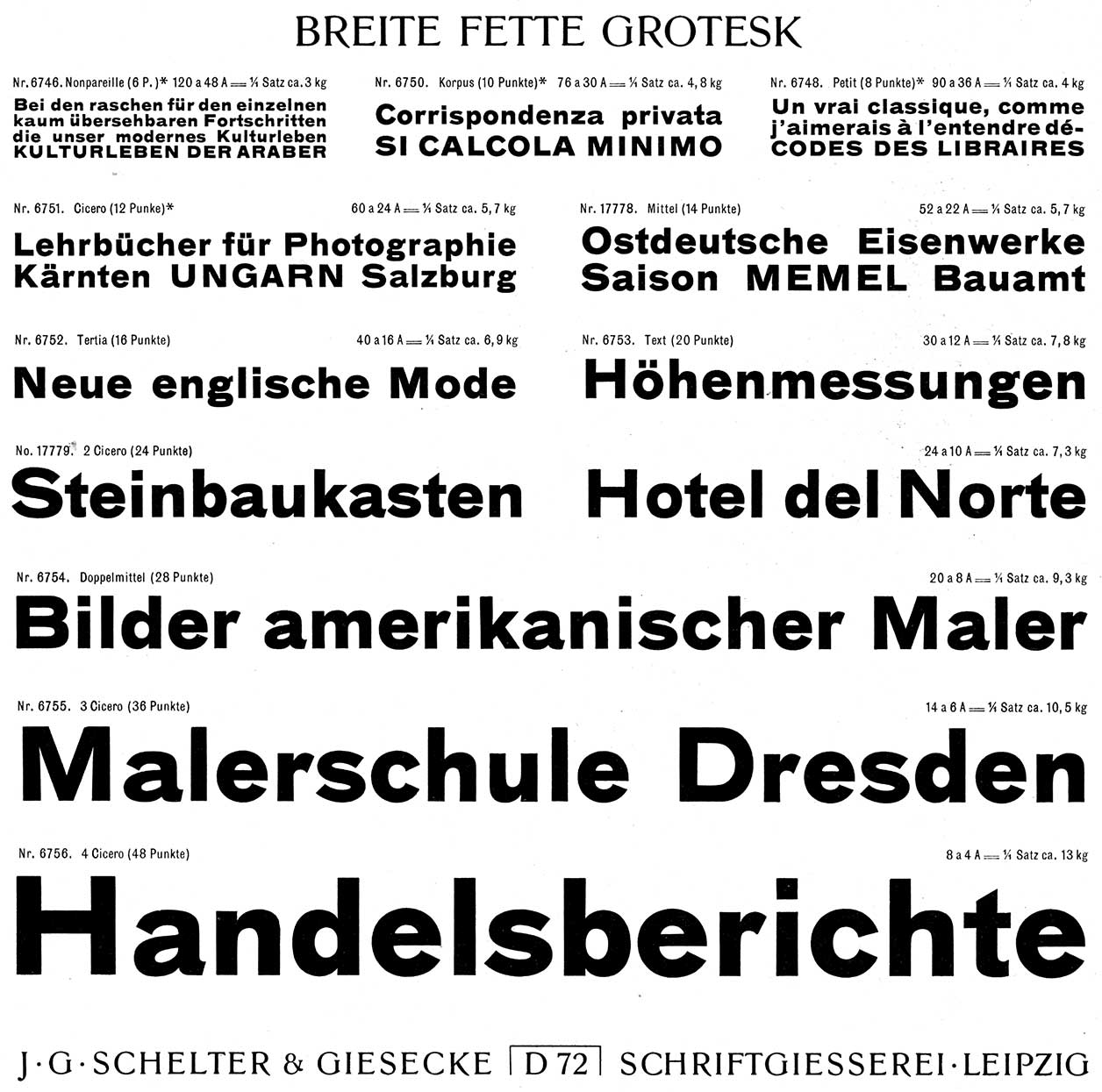 Original specimen from Schelter & Giesecke.
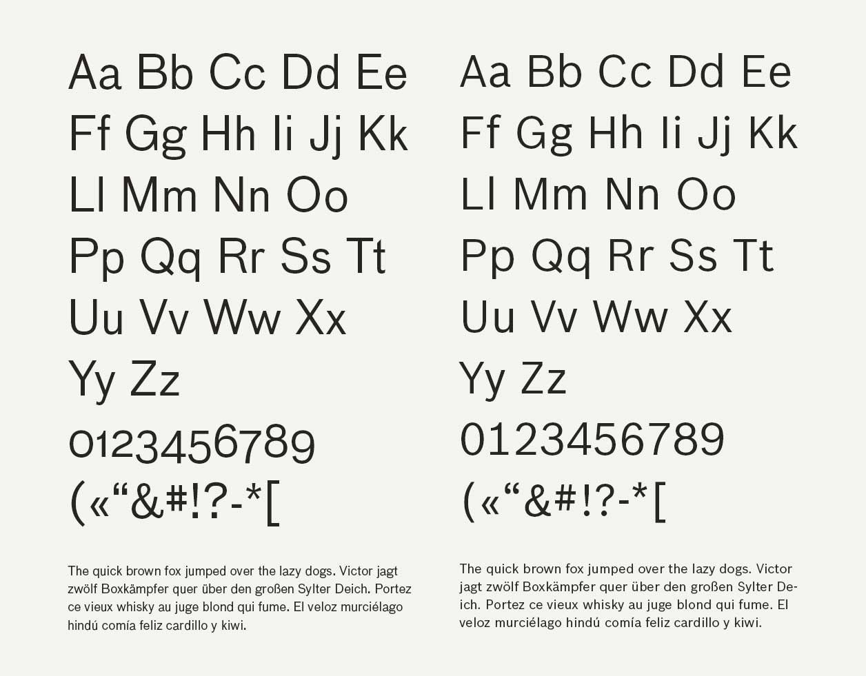 Bau to the left, Bosch Sans to the right.
Referencing Established Typefaces
So you always reference the established typefaces?– Of course you do, because that’s what we are used to. What else can you do? I’m not Roger Excoffon. We had some of his stuff on the table earlier today, this guy did the weirdest stuff; Calypso, Mistral, and Antique Olive for example. In the framework of the companies that have come to me this far, none of them has been that unusual. Those typefaces wouldn’t be believable for my clients. Maybe there are companies out there that could get away with Antique Olive. I doubt it, not in Germany. It’s a very French thing that reverse contrast. Top is heavier than the bottom, that’s Gallic, that’s French.
Contemporary Type Trends and Swiss Design
Have you seen the Grey typeface from Aurèle Sack?– No, that sounds like one of the disturbed Grotesks that all the Swiss are doing. Like Din meets an accident. It has become fashionable to do these kind of naively done typefaces, especially the Swiss guys do a lot of it. All the stuff that’s on Lineto, even some of the stuff that has come out of Optimo. The Swiss are so caught with their stupid Helvetica parts, they all take this sort of engineering model that they have, it’s their version of Gotham in a way, and then they try to rebuild some weirdness into it. «Let’s make it a little ugly, lets take Helvetica and make it a little dirty». And that’s what these typefaces are. This Grey typeface is typical sort of appropriation of a generic style and making it a little different, it doesn’t seem very natural to me. It might turn out nice, but for now I can see the historical model, and if I can see the historical model, then he has seen the historical model. He’s trying to make it different. There is no reason for that «r» to be taking up that much space in there. It’s this sort of 1910, shortly before the first world war. When every library was doing these sort of Grotesky things, but they were geometric in origin and still trying to be a little mannered. They have a little Art Nouveau stuff in them, a little high waste and a little condensed shapes. The «g» is so weird.
Akkurat and Drawing Methods
What about Laurenz Brunner then?– Laurenz is the great talent. His method with Akkurat was fantastic, drawing with acrylic. I saw his drawings for Akkurat. I think I was the first person who ever used Akkurat, we used it for Birkhäuser, which came out before he made the bold one. He still owes me the fat weight from ten years ago. He never did one, he did the medium and bold, but I wanted a really heavy one. I remember meeting him very early on, when he was just drawing the first one. He actually draws it big, like 10–12 centimeters, with acrylic. He uses my method, he basically takes Helvetica and paints it by hand, and then it becomes different.
I’ve heard that in Swiss high school, one assignment is to draw Helvetica from memory.
– Yes, the Swiss do that, and he did the same. He is a Swiss guy living in Amsterdam, does he still live in Amsterdam?
I think he lives here in Berlin.
– Oh, he’s here now. Of course he is, somebody told me that. I met Cornell Windlin, the Lineto guy, and he said that Laurenz was here now. Akkurat was, and still is, such a breath of fresh air. Because it was the first time somebody took that generic sort of Helvetica model, and made it personal. He mixed Din and Helvetica essentially, took Helvetica and made it a little straighter. Funny enough, that somehow made it more emotional and personal. The lowercase «a» is great, it’s a really nice typeface. The caps are a little boring, but that’s deliberate. I totally believe that’s because he drew it from memory with a brush, which is weird, because it’s very geometric in a way. But you still get different curves from drawing. Even if you draw geometric curves, doing it with a brush makes it different from doing it with a pencil or on a computer. I don’t know if he did Circular the same way. Circular is also everywhere now. It’s sort of like Futura, but not. It’s really interesting, but a little more mannered. Akkurat just happened, but Circular went through a few phases. It was once more like Futura, then the Futura in it went away again. Now it is still a geometric, but it has a little edge to it. But you can tell that he worked to get that edge, whereas Akkurat just happened. That’s why Akkurat is so fantastic, and that’s probably why he never did any more weights. It is probably difficult to still have that same kind of energy. With Akkurat he just did the regular, and then Cornell forced him to do the italic, which he didn’t even want to do. He promised me a black, I got to remind him about that. He should do it, because Akkurat is very successful. It’s one to go out of fashion and come back again, if he just added a few more weights. I should tell him that actually. Speaking of this method of drawing from memory, Christian Schwartz also did that last year, he drew Antique Olive from memory. Now my method has become everyone’s method. I didn’t invent it, but it’s a good method. I always wondered how I did it, and then I realized that drawing things from memory is basically what I do. I look at something and then do it from memory, not deliberately but that’s what we all do basically. If you’re a writer, it’s very hard to create your own style, because you are very influenced by what you read. I remember when I was 15 my teacher put a remark on my German essay that I was getting too close to the Spiegel. The German magazine Spiegel is a big thing in Germany. I was kind of imitating them, because at 15 you don’t have your own style. Which is good training when you realize it, and afterwards get away from it. Some people never realize what they imitate. When my teacher told me, I realized: «Shit, well I am kind of like following that pattern». But to learn design that’s what we all do. First you follow your teacher; some teachers want you to follow them, other teachers warn you if you follow them too much. But it’s the normal instinct, it’s what you see, and of course you emulate it. Especially with type, there are perfect models out there. That’s why I think sometimes: «Why are we designing any more fucking typefaces when there is Frutiger out there?». Frutiger is all we ever need. I mean seriously, if I had to go on the famous lonely island, I would probably bring Frutiger, because it’s the only typeface I know you can do anything with. Even set books in it; it’s boring, not as boring as Helvetica, but it’s totally the universal typeface, I think.
Control and Physical Features in Expression
Do you feel in control of it, do you feel that you can communicate any expression subtly?– Of course, we know all the stereotypes.
Do you reference and then add physical features?
– Yes, and that’s how we talk about it. When I talk to Ralph du Carrois, who does all of my digitalizations now; I say something like: «Do the rest with the «t» from this typeface and the «s» from that typeface. Do the end strokes like Frutiger or close them like Helvetica». You always reference, like musicians do. There are certain drum sounds, one musician says to the other «Why don’t you do the snare like what’s his name on that track». That’s how musicians talk to each other. It’s not because they imitate, it’s just it’s something that they all know. If I talk to Ralph about typefaces, we either talk about stuff that’s out there or that we’ve done together. «You remember that time when we discussed the serifs on the lowercase «r» on the ZDF typeface?» and so on. Everybody does that in their own business or domain. You talk and you reference stuff that’s out there.
Personal Library and Type Design Favorites
Have you made your own library then?– In my head yes, but not consciously. Of course you do, and you keep going back to whatever you consider your own standards. I have my favorites, and one of my favorites is Akzidenz Grotesk, because I grew up with it. There are a few of those historical models that I just happened to like always. I remember I never liked Bodoni when I worked in the print shop, because we always had to set those condolence ads in it. It was just horrible, it was always centered and it was: «Ehhh...», I really hated it. And I hated Mistral and all the other French typefaces because to me they were weird. That’s probably because of the environment that I worked in. I thought at the time that Univers was amazing, it was so cool and fresh. I am talking about the early or mid sixties when everything was kind of horrible, and Univers was new and cool. Now I know it wasn’t the typeface, I know that when I saw Univers, it was in sort of graphic design magazines. The pages were clean, and it wasn’t set centered, it was set off side a little bit with wide margins. Univers layouts looked like modern furniture, like my kitchen now. Whereas the stuff that I was supposed to set at the printshop looked sort of brown like my parents’ living room. It was that kind that you want to get away from when you’re sixteen or seventeen. Univers was this promise of stainless steel, it was modern and slick. It was more the fact that many people used Univers lowercase only, which was the Swiss fashion at that time. To this day I know that is what colored my impression of Univers, and I have to really fight to like Bodoni. Because those memories come back, they are like old dreams.
Professional Judgement and Typographic Decisions
Do you become more blind the more you work?– Well of course, but isn’t that what happens when you learn to be a professional? You turn your prejudice into judgement.
Design Choices and Letterform Details
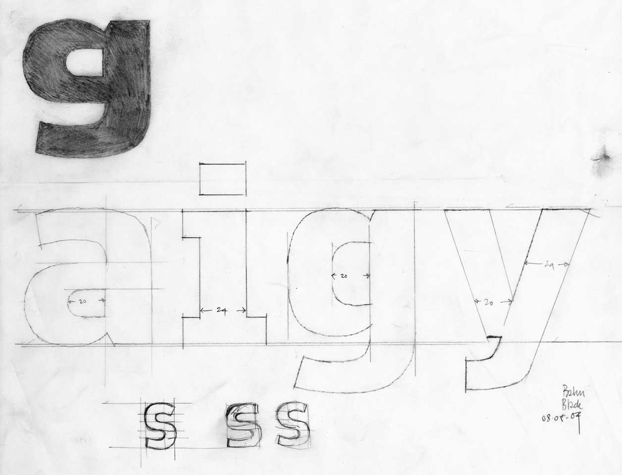
You often don’t link the strokes in the «y». Why is that?– I don’t know why that is. I remember the first time I saw it consciously was when I saw Günter Gerhard Lange’s Concorde. Concorde came out in 68 and it was the better version of Times New Roman, by Berthold. This was the time when I was trained on Berthold machines, and I knew that I had never seen that before. Lange did that to avoid the horrible join that happens in Times New Roman, that’s not really very elegant. The «y» is not a very frequent letter in German, so you don’t risk too much. We don’t see it very often, but you see quite a lot of it in english of course. Do you see it in Norwegian? Of course you do, with your «by» and stuff there, you have more of them than we do. I remember seeing it there, and then doing it in the bold condensed LoType in the seventies. I didn’t link the strokes, because I just couldn’t get it to work in that «v» shape. It just looked stupid, it would always fall over. The «v» is almost symmetrical, but when you have a really bold condensed «v», when one side is really heavy and the other is really light, it becomes very difficult to keep it from falling over. When you add the stupid bottom to it, that always make it fall over. In not linking them, you avoid it from falling over. It’s very simple, and now I do it kind of like a trademark. We also did it for the Autodesk guys, and they all said «Oh, this is really weird», and then I showed them why we did it, and then they loved it. I drew the other one and showed them that mine didn’t fall over and that it also makes it look a little different. Ever since the Meta «g», I should have done every «g» open at the bottom. I also do like the double decker «g», which I did in the Real typeface, which is my version of Akzidenz Grotesk. I like the English «g», the «Brillen-g» as we call it in German. I actually like it, it’s a terrible letter to draw because it’s too noisy and it always makes a big blob in the page. It’s not very practical, I just like it.
What does the «Brillen-g» express?
– Yes, it’s also the Anglo-American thing. The double decker «g» is actually a serif tradition. The sans typefaces that the Germans made, the Futura, Akzidenz Grotesk and Helvetica don’t have that in there, because they meant it was unpractical. And they are right, Helvetica was all about cleaning up and throwing shit out; No swelling, no contrast, no diagonals, really totally gridded, almost like a Din. This «g» is totally unpractical, its like the German ß, that’s also really unpractical and stupid, but I love it. And they are a bitch to draw. If you look at Franklin Gothic and News Gothic they have the double decker «g» in there. Because they have a different tradition, the Anglo-Americans never had a geometric sans. Gill isn’t, all the Monotype Grotesques aren’t. It was still kind of English, a bit weird. Something like Baskerville with the serifs taken off. Whereas Akzidenz Grotesk is Walbaum with the serifs taken off, much more geometric and regular. The English tradition also meant that they never lost the double decker «g», even though some of the Monotype Grotesques have a single storey «g» in there. Gill is essentially an antiqua with the serifs chopped off. The Anglo-American means not Germanic and it means a little more bookish, because it’s the serif model. I think the same goes for the «y», and I also like serifs on the «I» and the «r» even, because it gives them more space.
And the tailed «l» right?
– And the tail on the «l», but that’s a simple physical reason. You know why if you ever typed a keyword into your iPad, it’s a bitch to tell the I from the l, you really can’t tell. You don’t know if you got your shift key down or not. Meta had that early on and that’s simply because it’s important if you have small type. If you do that, you don’t have to have the serifs on the «I». You could have both, but you don’t need to. The reason for the serif on the «l» is not only legibility, it’s also that the «I», «l», «f», «t», and «j», to an extent, are so narrow, that they have no white space around them. This is putting in some whitespace between the letters. In an antiqua the «r» has serifs, the Grotesks do not, so when there’s no serifs, there’s no white space.
So that’s strictly functional then?
– Yes, it’s putting white space in between. Because otherwise, especially if you have tightly set Helvetica and write a double «l» with an «I» in there, it’s totally staccato. The rest of the characters in Helvetica are quite wide, and if you suddenly have an «n», «o» or «e» afterwards, which are really wide, the rhythm becomes really blotchy. If you put serifs or swings in there, you open up and regularize the white space. It is a very easy thing to do, and it looks so much better.
Making Typefaces Friendly and Appropriating Features
Are there other things from this library you can talk about? What if you want to make Univers more friendly?– Well, you can’t make Univers more friendly. The whole point of Univers is that it’s cool. Then there’s the way the serifs are bracketed for example. If the serifs are not bracketed it makes it much more engineered. As soon as you give them diagonal or round brackets they become more friendly. All these little curves that you add make it smooth all around. A regular slab serif doesn’t have bracketed serifs. The Serifa or the Officina model is not bracketed, they became more geometric, which also comes with a typewriter. Typewriter is another one of the stereotypes, that even people who have never seen one know. Typewriter is another one of those prejudice ones, born out of necessity. They had to make it monospace for it to work mechanically, that’s how it manages to get from metal to paper through a carbon cotton ribbon. Those are things that we all remember, like we all remember handwriting. The people that figured how to make monospaced fonts invented some tricks. Meta owes a lot to Letter Gothic, of course. Because how did those people solve those issues having a very limited expression on that very narrow space? How did they manage? Those people solved those problems because they didn’t think too much about it, they just did it. If you look closely as a type designer you suddenly realize that if you bracket that serif it’s going to make it warm. If I cut it, it’s not. Some features are just there to make the typeface look different. Yesterday we talked about Frank Griesshammer who made Quixo. Quixo is really weird, the way the shapes moves around. I see it because I’ve looked at it a lot. I showed it to Susanna Dulkinys, my wife, yesterday, and she is using it for a project. She doesn’t see the details like that, for her it just looks unusual in a sort of cheerful way. Frank who made it started with: «What happens if I turn the quill this way or that way». It’s everything you could do wrong in one typeface. But because he’s so good at it, he makes it look right. He broke all the rules and made it different from how it should be. So one could also do that, or like Antique Olive. I mean, you don’t have contrast at the top, for fuck’s sake. It’s heavier on the top, than the bottom. Who would ever do that? It would be like me walking around on my head all day long. It’s just rubbish, but it works. His idea was to use different tools for each weight, the thin weight is done with a very thin quill, and for the big fat one, he uses a brush. He watched what happened, and of course the big brush has a different stroke endings than the thin brush, which has less contrast. That’s a great method, and because he’s so good at it, and spent a lot of time on it, it actually doesn’t look contrived. It doesn’t look contrived because it looks connected to the tools. It looks authentic, because he did use the tools, he didn’t just pretend. When I saw his exercises years ago, I thought, this is never going to work. I thought this is so fucking ugly. Because they were so different, and now look at the family. If you don’t look at it closely, it kind of works. And then you look closer and think, this is how he made it work. It’s weird.
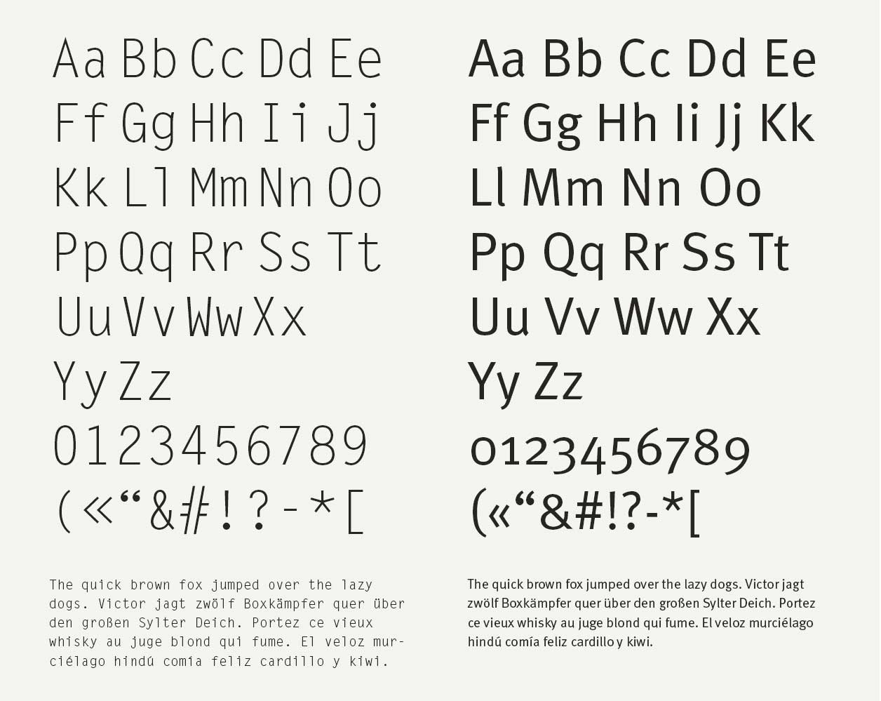 Letter Gothic to the left, Meta to the right.
Studying Type Design, Appropriation, and Schools
For new type designers, how do you study this?– Maybe there’s three styles or schools of type design. Or three purposes. There are historical models, the Garamonds, the Baskervilles, the Bodonis, the Helveticas and the Futuras. We see a lot of models, even the reverse contrast models. If you know anything about it as a graphic designer you compare it and say: «Oh, that looks like Futura», or «Oh, that looks like Garamond». Because there are models. Like composers, if you start to composing classical music, you reference symphonies. The way a symphony is built, as compared to a Trio or whatever. There are certain patterns that you reference. If you write poetry you have your classic rhyme schemes, whether it’s Boustrophedon or Hexameter. Maybe you just use them inadvertently, but you reference it. You try to do your own with it and appropriate them, and so do type designers. If you look at the type foundries, every foundry has a Times New Roman, Garamond, Helvetica, Futura and Din. They all do, even the Optimo and Lineto guys. François Rappo who does most of Optimo’s stuff has his Akzidenz Grotesk, which he calls Theinhardt, and he has his Didot, which he calls Didot Elder. Every foundry has a complete library now. All the designers have to sit down and say «How am I going to do my own Garamond?». Because you can’t do better than Garamond or Bodoni. Some of them just go back to the originals, like František Štorm, the Czech guy who has done the best Baskerville and Walbaum. He goes back to an original 10 point and does that faithfully. Some people just say: «I’m going to approach this by using a different tool then what was used for the original one». Use a brush instead of a pen for example, and then bingo, the same model but it looks different. I say: «I’m going to look at this for a couple of days, and then I close my eyes and redraw it». It will be in the classic genre, but it will be my own. Then there are people who try to do something new and unusual by overthinking it. They have a principle, lots of beginners do this, they say: «I’m going to make a typeface entirely made up from circles», which of course doesn’t work. The next guy comes out: «I’m going to make a typeface where the proportions are all 10 to 7», which of course doesn’t work either. These sort of preconceived conceptual models never work. Because unfortunately we spent a few thousand years making the Latin alphabet and it has to do with handwriting and technology, but over time. Pixels is another one of those genres. All the successful new genres come out of necessity. Once I did a typeface for an LED display with only triangular elements, where I had 15 triangular elements, and I had to make all the characters out of it. It’s a great constraint, and you’re still trying to make it look like Garamond or Helvetica, because those are the models that we have. So those are the schools of people. The appropriation, something that your mother would feel kind of comfortable with, but it still has its own little touch to it. By using a different tool than the historical guys or going back to the 10 point. And then there are the revolutionary guys.
Modernization in Re-Digitalization
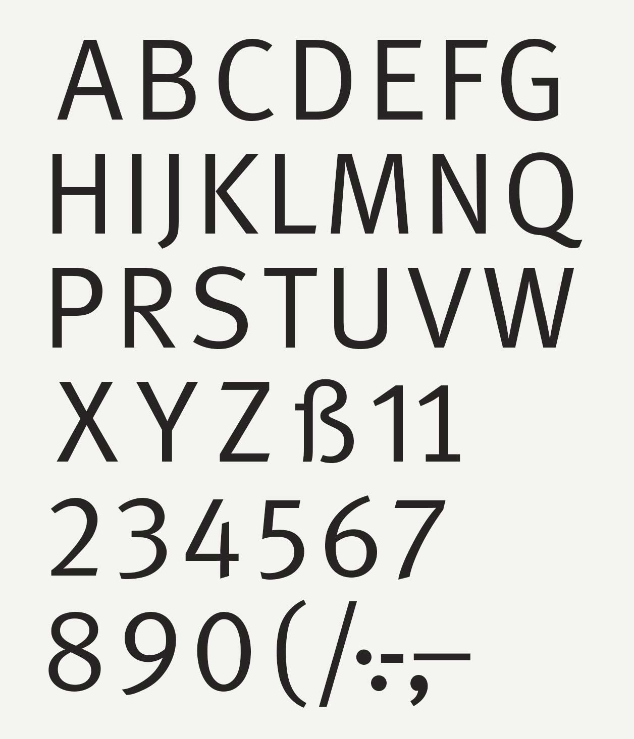
Should every re-digitalization modernize to the standards now?– Not necessarily, I mean maybe Grey is going to be a good typeface. It certainly could be. The model is there, and he just has to try to make it his own, like Laurenz made Helvetica his own by making it a little more geometric. Constructing it first, and then he painted over the drawings. The drawings were very square and through his painting with a brush, they got life in them again. When I made a typeface for the «Ich bin Erik» book, I made only one weight of this typeface called Real, which is my version of Akzidenz Grotesk Medium. I didn’t draw over it, I did it from memory, and I had a really hard time not making it exactly like Akzidenz Grotesk.
Because you knew it too well?
– I knew it too well. But I also, I don’t care. Some of it might be identical. I know I spent a lot of time on the «s», «e», «g» and «a», because I wanted them to be my own. I also made one weight in the middle, which doesn’t really exist. I didn’t start with the regular, I started with the medium weight, which one normally does not. That was what I wanted to do, and now I think it is my own. It’s not trying to be different.
The «a» in the Real typeface is quite different.
– Yes, it’s a little difficult because that Akzidenz Grotesk Halbfett Medium «a» is so fucking perfect. It’s difficult to do it different without it being silly. It’s really, really the most perfect «a» there is. So is the «s», only that medium weight though, because they weren’t related in those days. They didn’t make families, they made individual weights. That particular Akzidenz Grotesk Halbfett was only cut in large wood type and there’s only one version of it. It’s beautiful.
Emotional Expression in Contemporary Typefaces
If you were to do Officina or Meta again with any additional emotion. How would you do that?– We did a display version of Officina for the Economist, and then we published it later on. In the heavier weights Officina got very goofy, the client called it goofy. Because when the letters were very fat, they looked really bouncy. That just wasn’t for the Economist’s headlines, so we cut some of the diagonals off. Officina is essentially Letter Gothic anyway, the features have a purpose, they open up the space. They are not there because it looks good, they are there because otherwise you would get a big black blob on the page. I opened the counters as much as I could. I looked at Letter Gothic, as you can see, with a very narrow «m». Officina is almost monospaced. I did Officina right after the original Meta, but before Meta itself came out. It was made looking a lot at the laser writer and correspondence typefaces. People were using Courier, which I thought was horrible. Or they were using Times New Roman, which is also stupid. Because it didn’t look like a letter, it looked like book or a newspaper. So I thought we needed to have a good correspondence typeface, and still I think Officina is pretty good actually. If I say so myself, the very narrow caps are useful. It’s not sharp, it’s blunt, not round but blunt. I did that because at the time the laserwriters were only 300 dpi, and the edges would get rounded anyway, so I built it in. On screens it looks much better that way.
Drawing Approach and Character Selection
If you want to try a expression or a brand typeface, what’s the characters you would draw?– I always start with an «a» and «n». That gives you the basic settings. Because the «a» is difficult in small sizes. When you got «a», «n», «s» and «e» you have the typeface down. Well, «a» is difficult and fairly frequent, so it’s significant. It’s difficult because it has three shapes. And there is different ways of doing an «a». The «e» is the most frequent letter in most languages. «n» also is pretty frequent. «a», «i», «s» are all up there. The «i» is difficult because it’s the narrowest one, and you have to get the blob away from it. The «s» is just as complicated as the «a». So when you got «a», «n», «s», «e», down you have the typeface sorted. The rest is just very straight forward after that. Well, except the diagonals, I don’t like drawning the diagonals. I suck at «w», my «w» are usually to wide. They are really difficult, that’s why I chicken. «x» also, my «x» tend to be way to bouncy. One thing I did in both Meta and Officina deliberately, the counter spaces are actually square. When I made my first drawing of «o», the white space was almost a rectangle. You get this contrast in the «o». Because the inside is squarer than the outside, they’re not parallel. The conceptual idea was to make contrast between in and out, because we read inside and outside. When they meet, they create a contrast that helps reading.
Physical Features and Reference in Design
My approach to this was maybe kind of too focused on what the shapes tell themselves, but there seems like there’s no definite.– The physical features are a central part of type design, but you know them as well as I do. Because you see something and you references. Everybody reference. We reference something we know, and your mother would reference something she knows. She wouldn’t know the expressions but she would be like, «that looks like that brand or newspaper».
So you always feel your way to the result.
– Yes. But it works, people do recognize expressions, I’m always surprised.
Fashion and Type Design
Could fashion ruin typefaces?– Yes, if it’s too deliberate. Everybody is doing their Dins at the moment. Some of them are really bad at it. Because to do a Din that’s better than Din is difficult, Din is kind of too generic. But luckily, at the moment, all the fashions are about decoration. We have all these chromatic typefaces with drop shadows and Open Type overlays and destroyed filters. People now got all their typefaces in an antique version, a destroyed dirty version. Now you can buy Photoshop filters that make your artwork look like 1950s out of register print. There’s a rusty tin can filter which makes it look like it has been lying out in the shit for a summer.
Could fashion ruin a typeface like Garamond?
– They can ruin the particular one but Garamond is resilient, because it has become generic. It’s difficult to create a new generic, like Rotis for example, which came out in the late eighties. When it came out, a lot of modern people went totally crazy. A lot of the architectural design scene went and did everything in Rotis, and it looks really tired and old now. Rotis was too explicit, it was too heady. We have this thing in German we call «Kopfgeburt», which means born from the head. It’s too intellectual, he had too much theory, and it became a crap typeface. All these letters were predisposed, there was too much thinking behind it. Now it looks really, really mannered and tired. It is trying to hard to be different, and too different is kind of weird. It never had the chance to become a generic. Garamond might have been crap at the time it came out. What, fifteen hundreds? People probably thought it was horrible. But you know, it’s been horrible for 500 years and now we’re used to it. It doesn’t have to be good, it’s just that it has been around for a while, and we get used to it. That’s all there is to it. When Baskerville came out, some people wrote that it was illegible because it was too pointy and spiky. He had better quality than before, so it was sharp typography, but people weren’t used to sharp, so they thought it was horrible. People also thought taking the serifs of a typeface was horrible, ugly and in your face. And now engineers think serifs are old fashioned. People have their prejudice, but we can never destroy Helvetica, Garamond or Bodoni because they have become generics. For a reading society I have no idea what’s going to happen in fifty years time, but then again, we are back on screens that are better than paper, we have lost the pixels behind us already. Everybody thought we would all be used to reading five pixels, but I haven’t seen a pixel in a long time. Not even on kitchen machines, well I still have one. I think my fridge still has a pixel typeface, but that’s the last one. The next generation will have perfect type there.
Really?
– Yes, totally, the render engines have become good and cheap, why should they have pixels on there? Put proper type on there.
Neutral Typefaces and Thesis Work
Have you ever tried to make a as neutral as possible typeface?– No, because Kai Bernau has already done it, why should I do it?
Which one is that?
– One called Neutral. He made it his thesis in The Hague five or six years ago, and then he went back and made a little family. It’s quite nice, it’s a bit like Unica, which has just come out again as well. The Helvetica meets Univers from 77. André Gürtler and those guys, they just released it from Linotype. It is kind of similar to Neutral in a way.
Does that thesis work? Combining Helvetica and Univers?
– Well, it did there, because they actually realized the two were quite different. Again, not for your mother, but for us Univers and Helvetica have nothing in common. They merged them, and did it very successfully. Helvetica got the elegance of Univers, and Univers got the sturdiness of Helvetica. It’s actually quite nice. Neutral that Kai did ended up really similar. It turns out that really, both Univers and Helvetica were trying to be typefaces without any expression. If you look at it negatively, Univers is cold and has no expression, but it could also be elegant, depending on how you’re using it. If you combine it with boring Helvetica, it’s not a bad mix. Kai just overlapped half a dozen typefaces or so, and Neutral is what is left after that. There’s also this famous exercise by Frutiger, where he overlapped all his own typefaces. The core of it, the soul as it were, it has a typical Frutiger «a» and «e» and stuff. But because that’s basically how Frutiger draws his stuff. And sure, if I put all my typefaces over each other, there wouldn’t be that big a difference either.
Theory, Psychology and Legibility Research
Do you reference or read any theory about expressions or facial expression?– I think that sometimes we can rely on ourselves as professionals. There’s also a question of age. I think empirically we know all this shit. I wouldn’t specifically go and book a psychology course. Some things I think is general knowledge. If you read as much I do, you’ve come across all that stuff. Sometimes I would like to have more time to do research. Because the legibility research, as I said earlier, is all crap. People always compare really shitty stuff to really shitty stuff. They compare Times New Roman to Arial on a screen, and both of them are crap.
Do you think that people that read much could say if a typeface is legible or not?
– Yes, if you ask the right questions. The research guys do it, but you’ve got to have a real sample, and then all the parameters got to be right, you have got to make an optimal page. People won’t look at a typeface if the page is crap. If it’s too small or too large or the leading isn’t good enough, it won’t work. Then the typeface doesn’t matter, it only matters if everything else is equally good. In other words the typeface in itself isn’t as important as the designers would think. A lot of the research is actually wrong, at least in the studies that I’ve seen. But again if you pointed it out to people, and you had the same conditions it might be useful. But instead they just show people individual letters, and of course it’s rubbish. What’s this? «Duuuh», then they measured that it took them a split second to realize it was a lowercase «l», or whatever.
Revisions and the Value of Typeface Design
I keep seeing new flaws in my typeface every day, is it still like that for you?– The most difficult thing is to stop, because I could do every single letter again. But if you change one, you have got to change the next one. Luckily there’s a question of time, budget and age. I could go and redesign Meta, but why the fuck should I do that? It works, I mean I’ve done all that. I like the lowercase «a», and the bold one. Some things I like, some things are a little stupid. The «r» I have always hated, that looks like an Arial «r» already. It’s really not very nice, it goes in too much. The bold is much better, the bold is the best one. Because the bold came five or six years later, it’s actually a much better typeface. This «r» is horrible, what was I thinking?
In one of your lectures you said you took too little for designing typefaces. How much is a typeface worth?
– In the case of the Deutsche Bahn, the typeface is pretty much the whole brand. I gave them the red and white and the typeface, and that’s all they have. That’s a billion dollar brand, so they should have payed me a shitload more money.
For companies where it is not the whole brand, three weights with italic, no other languages. What is that worth?
– Ten thousand euros per weight, which isn’t very much if you think what they do with it. It’s okay if you do it in a week, it’s good money for a week. But if you think about it, what a company gets out of it. I think the whole Bahn stuff was a 100,000 euros for 23 weights, that’s nothing. For them, it seems a lot, its like 5000 euros per weight. But if you think what they have done with it, every single day for the last 10 years. 100,000, it’s nothing, it’s two ads in some international magazine.
But that is the type designers responsibility?
– Yes, we just charged for our time, which in this case is wrong. I’m not complaining, you’re not poor with it, but if you think how much they paid in the past with all the licenses, oh god. The Bosch guys had paid about half a million euros in a few years’ time, and then we did their whole family for less than 200,000 euros, it’s a shitload of stuff there.
They wouldn’t pay more?
– If they could pay over five years, 50,000 each year maybe, but they would look at it and think, «These few letters cost us 200,000 euros? My god, what a rip off». They have no idea, but why should they? They always get other proposals. The Autodesk guys got a proposal from someone else for like a quarter of what I’m charging them, but they still wanted us, because I had a good concept. There’s a lot of people who just go for the money, and let them go for it. It’s fine.
Like you said, the Deutsche Post didn’t want the first one.
– Yes, they were idiots. They payed a lot of money, and they got nothing for it. They paid some money for Meta, and never used it. And the fact that I became a bestseller had to do with the time, because there wasn’t that much around at the time, but that also means it would have worked for Deutsche Post. It would have been a successful brand. But I’m happy with the way it turned out, quite frankly.